1. ArchDaily
  2. Articles

Articles

Mies, the Modernist Man of Letters

This review of Detlef Mertins' book "Mies" - by Thomas de Monchaux - originally appeared in Metropolis Magazine as "Mies Reconsidered". According to de Monchaux, Mertins reveals the modernist master as a voracious reader who interpreted a wide variety of influences to arrive at his stripped-down style.

The quintessential page of the 528 that make up Detlef Mertins’s monumental new monograph on Ludwig Mies van der Rohe—entitled simply Mies (Phaidon, 2014)—is 155. There, you will find a reproduction, a page within a page, of page 64 of Romano Guardini’s 1927 book Letters from Lake Como—a book about modernity and human subjectivity—with Mies’s own annotations penciled in the margins, in a surprisingly ornate and delicate hand.

And there, you will find Mertins’s notes on Mies’s notes on Guardini: “Of all the books in Mies’s library, Guardini’s Letters is the most heavily marked. Mies highlighted passage after passage with bold and rapid margin strokes and wrote key words diagonally and in large script across the first pages of many of the chapters: Haltung (stance), Erkenntnis (knowledge), Macht (power).” Mertins’s vivid marginality, his attention to the divine details along edges, recalls the experience of reading the Talmud, that commentary on Jewish law and scripture in which, by marking and emending earlier readers’ marks and emendations, generations of rabbis enacted an intimate conversation across time and space. 

Read on for more insight into Mies' influences.

Mies, the Modernist Man of Letters - Image 1 of 4Mies, the Modernist Man of Letters - Image 2 of 4Mies, the Modernist Man of Letters - Image 3 of 4Mies, the Modernist Man of Letters - Image 4 of 4Mies, the Modernist Man of Letters - More Images+ 5

Rijksmuseum Revisited: The Dutch National Museum One Year On

The Rijksmuseum, which reopened last year after a decade of restoration and remodelling, is a museum dedicated to “the Dutchness of Dutchness.” Pierre Cuypers, the building's original architect, began designing this neogothic cathedral to Dutch art in 1876; it opened in 1885 and has stood guard over Amsterdam's Museumplein ever since.

Over the centuries, the building suffered a series of poorly executed 'improvements': intricately frescoed walls and ceilings were whitewashed; precious mosaics broken; decorative surfaces plastered over; and false, parasitic ceilings hung from the walls. Speaking in his office overlooking the Rijksmuseum’s monumental south west façade, Director of Collections Taco Dibbits noted how the most appalling damage was incurred during the mid-20th century: “everything had been done to hide the original building […but] Cruz y Ortiz [who won the competition to redesign the Rijks in 2003] embraced the existing architecture by going back to the original volumes of the spaces as much as possible.”

For Seville-based Cruz y Ortiz, choosing what to retain and what to restore, what to remodel and what to ignore were, at times, difficult to balance. Cruz y Ortiz found their answer in the mantra: 'Continue with Cuypers'. They threw the original elements of the building into relief but did not act as aesthetes for the 'ruin'. In contrast to David Chipperfield and Julian Harrap's restoration of Berlin's Neues Museum, for instance, Cruz y Ortiz rigorously implemented a clean visual approach that favoured clarity over confusion. What is original, what is restored, and what is new mingle together in a melting pot of solid, understated architectural elements. Sometimes this approach contradicted Cuyper's original intentions; however, more often than not it complements them in a contemporary way.

Rijksmuseum Revisited: The Dutch National Museum One Year On - RefurbishmentRijksmuseum Revisited: The Dutch National Museum One Year On - RefurbishmentRijksmuseum Revisited: The Dutch National Museum One Year On - RefurbishmentRijksmuseum Revisited: The Dutch National Museum One Year On - RefurbishmentRijksmuseum Revisited: The Dutch National Museum One Year On - More Images+ 34

Learning and Research Center (LRC) University of Alcalá / CDE Arquitectura

Learning and Research Center (LRC) University of Alcalá  / CDE Arquitectura - Image 15 of 4
© Bernardo Corces

Architects: Celis-Echeverría CDE Arquitectura Location: Plaza de San Diego, S/N, 28801 Alcalá de Henares, Madrid, España Partners Design Team: Ernesto Echeverría, Flavio Celis Architects In Charge: Ernesto Echeverría, Flavio Celis, Blanca Moreno Area: 11455.0 sqm Year: 2014 Photographs: Bernardo Corces

Learning and Research Center (LRC) University of Alcalá  / CDE Arquitectura - Image 14 of 4Learning and Research Center (LRC) University of Alcalá  / CDE Arquitectura - Image 12 of 4Learning and Research Center (LRC) University of Alcalá  / CDE Arquitectura - Image 24 of 4Learning and Research Center (LRC) University of Alcalá  / CDE Arquitectura - Image 27 of 4Learning and Research Center (LRC) University of Alcalá  / CDE Arquitectura - More Images+ 23

Prisons and Human Rights Violations: What Can Architects Do?

Originally published by the Architectural Review as "Discipline and Punish: the Architecture of Human Rights", this article by the founder of Architects Designers and Planners for Social Responsibility Raphael Sperry outlines how prison design in the US and elsewhere is violating fundamental human rights, and how some architects have come to be complicit in these designs.

We think of architectural regulations as being there to ensure that buildings are safe for the public. But what if a building’s harm is not caused by unexpected structural failure but by the building performing exactly as intended? Can a building designed to facilitate human rights violations amount to a violation in itself? And what is the responsibility of the architects involved? These are the questions at the centre of the current debate in America around the architectural profession’s involvement in prison design.

Read on for more on the ethics of prison design after the break

The Depreciating Value of Form in the Age of Digital Fabrication

In this article, originally appearing on the Australian Design Review as "Tolerance and Customisation: a Question of Value", Michael Parsons argues that the complex forms made possible by digital fabrication may soon be victims of their own popularity, losing their intrinsic value as they become more common and the skill required to make them decreases.

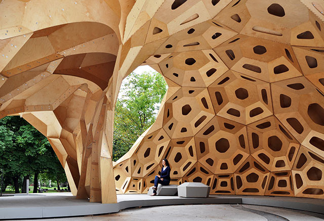
The idea of tolerance in architecture has become a popular point of discussion due to the recent mainstreaming of digital fabrication. The improvements in digital fabrication methods are allowing for two major advancements: firstly, the idea of reducing the tolerance required in construction to a minimum (and ultimately zero) and secondly, mass customisation as a physical reality. Digital fabrication has made the broad-brushstroke approach to fabrication tolerance obsolete and now allows for unique elements and tolerance specific to each element. The accuracy that digital fabrication affords the designer, allows for the creation of more complex forms with greater ease and control. So far, this has had great and far reaching implications for design.

Read on to find out how this ease of form-making could diminish the success of complex forms. 

The Architecture of Kowloon Walled City: An Excerpt from 'City of Darkness Revisited'

In light of the release of a second, revised edition of City of Darkness -- the authoritative text on Kowloon Walled City, which you can help Kickstart here -- authors Greg Girard and Ian Lambot have shared an excerpt from City of Darkness Revisited.

The early phases of the Walled City were characterised by predictable building typologies and the buildings were constructed on the principle of squatters’ rights, with random construction on spots of available land by whoever got there first. Alleyways and passages evolved – unplanned – into the established ‘map’ of the City, which would remain until it came down. A basic electric supply existed, increasingly burdened by illegal connections that frequently overloaded the system, and the few standpipes supplied the only water. As the need to accommodate the ever growing residential and commercial populations forced it to in the 1960s, the building typology of the Walled City made the leap from two- to three-storey residential structures to taller, six- to seven-storey ones. This represented an important threshold, because at these greater heights the buildings unavoidably became more complex and required greater labour to realise, reinforced concrete, more investment, and so on. They also required a different way of living. Water had to be transported up to the higher floors by hand. Likewise the propane gas canisters that furnished fuel to cook or heat water.

The Architecture of Kowloon Walled City: An Excerpt from 'City of Darkness Revisited' - Image 1 of 4The Architecture of Kowloon Walled City: An Excerpt from 'City of Darkness Revisited' - Image 2 of 4The Architecture of Kowloon Walled City: An Excerpt from 'City of Darkness Revisited' - Image 3 of 4The Architecture of Kowloon Walled City: An Excerpt from 'City of Darkness Revisited' - Image 4 of 4The Architecture of Kowloon Walled City: An Excerpt from 'City of Darkness Revisited' - More Images+ 5

Archaeology of the Periphery: Moscow Beyond Its Center

In Archaeology of the Periphery, a publication emerging out of the Moscow Urban Forum, a variety of specialists tackle the issue of a strategy for the development of Moscow's metropolitan area. As one of the best examples of urban concentric development, teams of engineers, architects, planners, economists and sociologists, studied the Russian metropolis with a pointed focus on the periphery—specifically the territory between the Third Ring Road and the Moscow Ring Road. Using an "archaeological" approach, the study reveals entrenched and hidden planning structures in order to increase the awareness and attractiveness of the periphery. Archaeology of the Periphery argues that examination of the city's fringe requires different methods of analysis than would be applied to traditional city centers.

"As the centre sets a certain quality of life and serves as a benchmark for the entire city, the high "gravitation" of the centre makes the signs of urban life invisible on the outskirts. Different optics are required in order to work with the non-central urban space. The tactic of "taking out" the centre and "sharpening the focus" on the peripheral territory will reveal what has been obscured and help identify the processes that take place, study potential, support or control the current forces at play.

The term "periphery," which is based on the opposition to a semantic centre is used in a wide range of scientific fields. The myriad of approaches underlines the ambiguity of the phenomenon and at the same time provides a base for an multidisciplinary research. This research was performed by experts in sociology (S), politics (P), architecture and urban planning (A), culture (C), economics (E) and big data (D). Methodology — SPACED — allows a broader view of the actual and potential intersections, going."

Surreal Renderings of Disaster-Resistant Structures

The following article by Priscilla Frank originally appeared in The Huffington Post as "Artist Designs Surreal Futuristic Forts That Can Withstand Natural Disaster."

Dauphin Island, located off the coast of Alabama in the Gulf of Mexico, is known for experiencing perpetual and catastrophic hurricanes. When a storm hits the small island of around 1,200 people, it often washes away much of the coastline with it, leaving residents to rebuild their homes again and again following every big storm.

Artist Dionisio González became fascinated by this society's ability to endure creation and destruction in such rapid succession, willingly succumbing to the whims of nature's cycles time and time again. The artist, who has always held an interest in architecture, embarked on a mission to design surreal structures that would better suit the fraught island's populous, fusing fantasy with the inhabitants' inevitable reality.

More on González's surreal architectural images, after the break...

A Theory of Architecture Part 3: Why Primitive Form Languages Spread

As you may have seen, ArchDaily has been publishing UNIFIED ARCHITECTURAL THEORY, by the urbanist and controversial theorist Nikos A. Salingaros, in serial form. However, in order to explain certain concepts in greater detail, we have decided to pause this serialization and publish three excerpts from another of Salingaros’ books: A THEORY OF ARCHITECTURE. The first excerpt explained the difference between “Pattern Language” and “Form Language,” while the second established how these languages can combine to form the “Adaptive Design Method.” The following, final, excerpt distinguishes between viable, complex form languages that have evolved over time and primitive, “non-languages” that have come to dominate the 20th century due to their iconic simplicity (and despite their non-adaptive characteristics).

Independently of their technological achievements, all groups of human beings have developed a richly complex spoken language. Differences arise in specificities, in the breadth of vocabulary for concepts important to that culture, and in their transition to a written language, but those do not affect the general richness of the language. Every language’s internal structure has to obey general principles that are common to all languages. A primitive language or non-language, by contrast, is characterized by the reduction or absence of such internal complexity and structure. The complexity of human thought sets a rather high threshold for the complexity that any language has to be able to express through combinatoric groupings. 

Turning now to architecture, a viable form language is also characterized by its high degree of internal complexity. Furthermore, the complexity of different form languages has to be comparable, because each form language shares a commonality with other form languages on a general meta-linguistic level. A primitive form language severely limits architectonic expression to crude or inarticulate statements. 

Simplicity, Structural Clarity & Sustainability: How SOM Remains a Global Leader

Originally posted under the title "Well-Oiled Machine" on Metropolis Magazine, this fascinating article by Ian Volner profiles the international behemoth that is SOM, exploring how the practice has remained so prominent - and relevant - after 78 years, and what it is that stylistically unites a practice spread across five continents with more than 10,000 buildings to their name.

Frank Lloyd Wright called them the “Three Blind Mies.” Louis Skidmore, Nathaniel Owings, and John O. Merrill were the architectural troika whose namesake firm—founded in Chicago in the mid-1930s—became something like the Julia Child of postwar design, delivering European sophistication to middle America at midcentury. Through hundreds of buildings in cities all across the country (and, later, around the world) the office turned the stringent aesthetic of German master builder Ludwig Mies van der Rohe into an architectural metonym for big business. Whether you look at rows of sleek glass skyscrapers and see grace and economy, or only the “thousand blind windows” of Allen Ginsberg’s monstrous “Moloch,” it’s no stretch to say that you have Skidmore, Owings & Merrill (SOM) to thank for them.

More on SOM's huge influence after the break

In Drawings, The Historical Trajectory of Soviet Architecture

In Drawings, The Historical Trajectory of Soviet Architecture - Image 3 of 4
Yakov Chernikhov, Factory building, Ca. 1931, Drafting pen, ink and pencil, 298 x 248 mm. Image Courtesy of the Tchoban Foundation

This article by Ross Wolfe, originally posted on Metropolis Magazine as "Cultural Divide: The 'Paper Architecture' of the USSR" explores the complexity of various Soviet architecture movements through the lens of paper architecture.

In the history of 20th-century Russian architecture, there exists a central struggle. In one corner, the Constructivists, champions of light, airy, and functional buildings that drew their power from the social and aesthetic revolutions of the 1920s; in the other, the Stalinist architects, whose thuggish hybrids and clumsy pastiche became the predominant vernacular throughout the Soviet republics. The latter, as we know, eventually came out on top.

Things are rather more complicated, of course, as an recent exhibition at Berlin's Tchoban Foundation argued. Architecture in Cultural Strife: Russian and Soviet Architecture in Drawings, 1900-1953 brings together a total of 79 unique architectural delineations that chart a historical trajectory running from the twilight years of the Romanov dynasty up to Stalin’s death by the midcentury.

Read on for more about the multiple movements that made up the whole of Soviet architecture.

The Burgeoning Craft of 3D Printing

The Burgeoning Craft of 3D Printing - Image 3 of 4
KPF’s models of concepts, facades, and building details. Image Courtesy of John Chu/Kohn Pedersen Fox Associates

This article by Marc Kristal from Metropolis Magazine, originally titled "Digital Details," looks at the work of NRI, a New York company that is leading the way when it comes to 3D Printing (or rather, additive manufacturing) - finding that there is a craft in these machine-produced models after all.

First things first: The term “3-D printing” is a misnomer according to Arthur Young-Spivey, the digital fabrication specialist at NRI—a 116-year-old, New York–headquartered supplier of reprographic services to architects and their tradespeople. “The correct term is ‘additive manufacturing,’” he explains. “People call it 3-D printing because it enables you to wrap your head around it, but in some ways it’s confusing.”

Young-Spivey has a point, as the process by which a digital file is converted into an object isn’t “printing” in the commonly understood sense of applying pigment on a substrate. With 3-D printing, he says, “Instead of using paper, you’re printing with powder or plastics. It’s all one layer at a time.” The thinner the layer, the better the quality, and the longer the process takes. “And there’s always post-production processing, to clean up the model,” he adds. “That’s why ‘additive manufacturing’ is a more accurate description.”

Read on for more on the work of NRI

Forget Flying Cars - Smart Cities Just Need Smart Citizens

This article by Carlo Ratti originally appeared in The European titled "The Sense-able City". Ratti outlines the driving forces behind the Smart Cities movement and explain why we may be best off focusing on retrofitting existing cities with new technologies rather than building new ones.

What was empty space just a few years ago is now becoming New Songdo in Korea, Masdar in the United Arab Emirates or PlanIT in Portugal — new “smart cities”, built from scratch, are sprouting across the planet and traditional actors like governments, urban planners and real estate developers, are, for the first time, working alongside large IT firms — the likes of IBM, Cisco, and Microsoft.

The resulting cities are based on the idea of becoming “living labs” for new technologies at the urban scale, blurring the boundary between bits and atoms, habitation and telemetry. If 20th century French architect Le Corbusier advanced the concept of the house as a “machine for living in”, these cities could be imagined as inhabitable microchips, or “computers in open air”.

Read on for more about the rise of Smart Cities

Material Substance: When Material and Mechanism are One

The following is the first article of Material Substance, a column, penned by Christopher Brenny and presented by AD Materials, which investigates the innovative applications of materials in architecture.

A material is nothing without a process. The characteristics of plastic, for example, vary dramatically depending on where and how the raw material is applied during the forming process. The same material can be used to create a bag, a solid container, or a woven textile. The difference between a disposable water bottle and carpeting is so distinct that one could not make the material connection without some foreknowledge of the manufacturing process of each.

The result of this material ecosystem is a scenario in which design and manufacturing must inform one another. This connection often moves so slowly in the building industry that it is difficult to perceive and very slow to adapt. Shape memory alloys such as nitinol (muscle wire), for example, are gradually moving into public nomenclature. While the novelty of such materials is ripe for exploration, application has proven difficult as the cost of such materials is quite prohibitive. Shape memory alloys, unless they are developed using more abundant metals such as aluminum, will likely remain a niche product developed for very specific applications.

Memory plastics, while less developed and responsive, have significant potential to become a familiar fixture in our daily lives. Combining this technology with the lightweight, structural capabilities of foamed materials, our preconceptions of the portable and flat packed may soon transform from disposable and insubstantial into something much more beautiful and valuable.

The Indicator: Thank You, Patrik Schumacher

First off, I would like to thank Patrik Schumacher for taking to Facebook on March 17 at 9:45pm to let off steam -- thus starting a meaningful discussion on the role of the architect in society and culture. We could deconstruct it line by line, but I don’t think that will yield much in the way of enlightenment. What I take from it is that architecture creates form and should be free to do so without being restricted by ethical or moral imperatives to be social or political. But, as Benjamin Bratton remarked in reply to Schumacher, “To set the political to one side and at the same time make grandiose claims for how architectural form can in fact ‘remake civilization’, is a self-defeating program.”

Perceptions on the role of architecture in society can easily fall along class, race, and national lines. Coming from a place of privilege, it is easy to assume an apolitical, form-making agenda for the profession. The argument that architecture has nothing to do with the social domain, or the “content” as Schumacher calls it, is an argument for political conservatism, a hands-off, sink or swim argument for social Darwinism, that limits the range and impact of high architecture. Why can’t the best and most challenging forms of architecture penetrate through all social strata? Why shouldn’t it serve the poor? And why shouldn’t this be one criteria among others for judging the value of architecture? 

A Theory of Architecture Part 2: The Adaptive Design Method

As you may have seen, ArchDaily has been publishing UNIFIED ARCHITECTURAL THEORY, by the urbanist and controversial theorist Nikos A. Salingaros, in serial form. However, in order to explain certain concepts in greater detail, we have decided to pause this serialization and publish three excerpts from another of Salingaros’ books: A THEORY OF ARCHITECTURE. The previous excerpt explained the difference between “Pattern Language” and “Form Language.” The following excerpt will establish how these languages can combine to form the “Adaptive Design Method.”

Proposition: An adaptive design method arises out of a complementary pair consisting of a pattern language and a form language.

I have indicated very briefly what a pattern language and a form language are; we still need to understand what an adaptive design method refers to. Out of many contemporary approaches to design, there are very few that result in structures and environments that are adapted both to physical human use, as well as to human sensibilities. In the past, the opposite was true. Human use is straightforward to understand: the physical dimensions and geometry have to accommodate the human body and its movement.

By accommodating human sensibilities, I mean that environments should make human beings feel at ease; make them feel psychologically comfortable so that persons can carry out whatever functions they have to unselfconsciously, without being disturbed by the built environment in any way. This imposes a strong constraint on the design process to adapt to the many factors (both known and unknown) that will influence the user on many levels, including emotion. An adaptive design method should accommodate all these criteria, and this Chapter shows how this may be accomplished.

Why Africa's Cities Need African Planning

In this article, originally posted on Future Cape Town as "Designing African Cities: Urban Planning Education in Nigeria", Professors Vanessa Watson and Babatunde Agbola discuss a paradigm shift occurring in Nigerian Planning Schools: from the American and European planning theories that have so far been applied in Nigeria to new theories more suited to dealing with the unique challenges presented by African cities.

In June 2011, the Governor of Osun State inaugurated a 10 man Committee for the state Urban Renewal Programme. The Committee of which I was the Chairman was to prepare an Urban Renewal Master Plan for each of the 9 selected cities in the state. At the inauguration, the Governor emphasized and re-emphasized that the type of plans he anticipated for each of these cities are not the types and models of New York, Washington, London or any other Euro-American cities. The plans were to reflect African cities' realities and thus have relevance for the lives of the residents of these cities.

These observations of the Governor point to the widespread belief of Nigerians that there is an observable disconnect between what the planners learn and know and what they put into practice for the general welfare and liveability of the populace. Admittedly, theory feeds and inform practice but when theories of other climes are transplanted for practice in another, the result cannot but be disastrous. Such is the effect of received contemporary planning education and knowledge on the morphology of Nigerian towns and cities.

Read on to find out what is being done about this education conundrum

Light Matters: Sacred Spaces

The use of light can lead to very diverse feelings: a ray of sunlight calls attention; glare overpowers; the nocturnal sky fascinates, while a dense dark forest arouses fear. Religions have made use of these experiences to convey the mystic aspects of their respective deities — accordingly, so too do their erected buildings.

After the break, an exploration of the different approaches for using light as a vehicle of symbolic meaning and spiritual experience in religious spaces.

Light Matters: Sacred Spaces - Image 1 of 4Light Matters: Sacred Spaces - Image 2 of 4Light Matters: Sacred Spaces - Image 3 of 4Light Matters: Sacred Spaces - Image 4 of 4Light Matters: Sacred Spaces - More Images+ 4

Ban vs. Schumacher: Should Architects Assume Social Responsibility?


The Indicator: Will We Stay Silent? The Human Cost of Qatar's World Cup

Qatar says the World Cup projects are “on track,” but the International Trade Union Confederation (ITUC), which has been investigating worker deaths in the Gulf Emirate for the last two years, vehemently disagrees. To date there have been 1200 worker deaths associated with the on-going World Cup projects. A scathing report, issued by the ITUC on March 16, claims that unless significant improvements are made to working conditions on World Cup-related sites at least 4000 more migrant construction workers could lose their lives. This would mean that those construction sites are “on track” to kill 600 workers per year, or at least 12 per week until the ribbons are cut and the fireworks are set off.

At a FIFA executive committee meeting held in Zurich on March 20, FIFA president Sepp Blatter stated, “We have some responsibility but we cannot interfere in the rights of workers." Likewise, local FIFA organizing committee in Qatar says workers are not their responsibility. Zaha Hadid said the same.

However, given the increasing chorus of headlines along the lines of “The Qatar World Cup is a Total Disaster” they may have to say something stronger on the issue at some point — or have the image of their architecture tarnished. Of course we all know that what they mean is that legally it is not their responsibility. But does that mean they should be sitting back, not even attempting to influence change?

Get all the facts on the situation of the Qatar construction workers, after the break…

The Pritzker Prize: Making Architects "Starchitects" Since 1979 (But at What Cost?)

The coveted title “Pritzker Prize Laureate” is more or less synonymous today with the label “star-architect,” a term I loathe and that most of those described as such will probably find irritating and embarrassing. And for good reason. Stardom in the sense of celebrity does not help the cause of architecture. Wang Shu’s wife, Lu Wenyu, said as much when she asked not to be named as co-laureate with her husband. In an interview with El Pais, she remarked, “I’m happy to be able to do architecture that I believe helps our towns and cities to be better. I’m convinced that to talk about this awakens interest in others – not being famous.”

Of course the Pritzker Prize does not set out to create a school of architects famous for being famous, but to recognise, celebrate and support talent, persistence and perhaps a unique contribution to the cause of architecture. The prize winners each deserve that recognition whether we agree or not with the choice of an individual recipient.

The fame culture is generated not so much by altruistic cultural institutions, but largely by a star-struck media wanting to create a cast of famous characters to write about. There is, of course, pressure from editors to do so, too, fearing perhaps that anything else might lose readers hungry for celebrity culture. Of course, the critic gains a kind of minor celebrity status, too, through association with this “star” culture.

The Gravity Stool by Jólan van der Wiel, magnetic innovation

Young dutch designer Jólan van der Wiel has been announced as the winner of the Contest for young designers at the imm cologne fair.

Using a magnetic plastic compounds, magnets and simple gravity, Jólan gives birth to the Gravity Stool, an expressive piece of furniture that is like a frozen moment of physics exposing the forces in action. You can see the full process on the above video by Miranda Stet.

The Gravity Stool by Jólan van der Wiel, magnetic innovation - Featured Image
© Jólan van der Wiel

The Gravity Stool thanks its unique shape to the cooperation between magnetic fields and the power of gravity.

Pritzker Juror Alejandro Aravena on Shigeru Ban: Virtuousity in Service of Our Most Urgent Challenges

The following is Alejandro Aravena's response to the Shigeru Ban's Pritzker win. Aravena is the executive director of the firm ELEMENTAL S.A and a member of the Pritzker Jury who selected Ban as this year's Pritzker Laureate.

Shigeru Ban has expanded the field of architecture in unexpected ways. He has proved that the inspired artist and the skilled designer is not inevitably condemned to work for a privileged elite, but that innovation can take place while working for the majority, particularly those historically underserved, forgotten or neglected. In order to do that, he redefined the approach to deal with difficult, urgent and relevant challenges, replacing professional charity by professional quality. Ban has shown that no matter how tough the circumstances or scarce the means, good design far from being an extra cost carries the added value of sharp efficiency, power of synthesis and an uplifting feeling.

15 Things You Didn't Know About Shigeru Ban

You probably know by now that Shigeru Ban has won this year's Pritzker Prize, but did you know he almost went to university to play rugby? Or that he constructed his home without pulling down a single tree? These and many more fun facts on the 38th Pritzker laureate, after the break.

You've started following your first account!

Did you know?

You'll now receive updates based on what you follow! Personalize your stream and start following your favorite authors, offices and users.