1. ArchDaily
  2. Articles

Articles

Could Ho Chi Minh City's Architecture Be Saved by Its Economic Rut?

In this article, originally published in Metropolis Magazine as "A Time-Out," Carl Robinson reminisces about the architecture of the Ho Chi Minh City he remembers from the 1960s and discusses how the urban landscape has changed in subsequent years. As Vietnam grapples with economic downturn, he asks, how might the city to develop?

Over the past 15 years, as Vietnam finally left its long years of war behind, the former capital of South Vietnam—Saigon—became the country’s economic powerhouse. Until fairly recently, Ho Chi Minh City (HCMC) was a boomtown. Even before touching down at its busy international airport, I see new buildings rising up through the sprawling and tightly packed suburbs, splayed across the city’s surrounding delta landscape and muddy meandering rivers.

Off in the distance along the wide Saigon River, where the spires of the city’s French Colonial Roman Catholic cathedral once dominated downtown, an impressive silhouette of high-rises reach to the tropical sky. The city’s twenty-first-century feel continues through its sweeping new terminal (designed by GWA) and then down a wide boulevard past contemporary office buildings and shops. Eventually I reach the intimate tree-lined streets of old Saigon, the residential quarter created by the French more than 150 years ago.

Honoring Architecture's Digital Pioneers

Many would consider Greg Lynn the leader of computer-aided design in architecture - but Lynn himself begs to differ. He and the Canadian Centre for Architecture recently collaborated on "Archaeology of the Digital," the first in a series of exhibitions that will showcase the work of the earliest adopters of digital techniques in architecture. The exhibit, which opened on May 7, focuses on work by Frank Gehry, Peter Eisenman, Chuck Hoberman, and Shoei Yoh. In this interview, originally published in Metropolis Magazine as "Computer Control," Avinash Rajagopal speaks with Greg Lynn about some of the projects and the inspiration behind the exhibit itself.

Masoro Village Project / GA Collaborative

The construction of a small single-family home twenty kilometers north of Kigali, Rwanda is now complete. The building is demure: three small bedrooms, a modest living room, and a space for cooking. Poor material availability and financial limitations meant that practicality was its primary design muse. The house is the prototype for a series of homes that the designers, GA Collaborative, will build in Masoro for members of the women’s cooperative l’Association Dushyigikirane. With the project’s uncommon building method—earthbag construction, the first of its kind in Rwanda—GA Collaborative intends to empower its clients with knowledge of an inexpensive and speedy construction technique that requires little training and no prior construction experience.

Toward Cycle Cities: How Architects Must Make Bikes Their Guiding Inspiration

If Henry Ford were reincarnated as a bike maker, Le Corbusier as an architect of buildings and cities for bikes, and Robert Moses as their bike-loving ally in government, today’s bike plans would be far more ambitious in scope. Ford would be aiming to sell billions of bikes, Corb would be wanting to save the whole world, and, even if it took him a lifetime, Moses would be aiming to leave a permanent mark. 

They would want to give bicycle transport a leg-up, like the leg-up the motorcar received from farmlands being opened for suburban development. So who are our modern-day, bicycle-loving Le Corbusiers? And what, exactly, is their task?

Unified Architectural Theory: Chapter 1

We will be publishing Nikos Salingaros’ book, Unified Architectural Theory, in a series of installments, making it digitally, freely available for students and architects around the world. The following chapter, "The Structure of Architectural Theories," posits that architecture, if it is truly to work with natural ecosystems, must adopt a scientifically-informed, systemic approach. If you missed the introduction, you may find it here.

Architecture is a human act that invades and displaces the natural ecosystem. Biological order is destroyed every time we clear native plant growth and erect buildings and infrastructure. The goal of architecture is to create structures to house humans and their activities. Humans are parts of the earth’s ecosystem, even though we tend to forget that.

Logically, architecture has to have a theoretical basis that begins with the natural ecosystem. The act of building orders materials in very specific ways, and humans generate an artificial ordering out of materials they have extracted from nature and transformed to various degrees. Some of today’s most widely-used materials, such as plate glass and steel, require energy-intensive processes, and thus contain high embodied energy costs. Those cannot be the basis for any sustainable solution, despite all the industry hype. 

Resource depletion and a looming ecological catastrophe are consequences of detachment from nature, and a blind faith in technology to solve the problems it creates. 

How Arup Became The Go-To Firm for Architecture's Most Ambitious Projects

How Arup Became The Go-To Firm for Architecture's Most Ambitious Projects - Image 5 of 4
The Swiss Re Tower, Norman Foster & Arup Engineering. Image © Shaun Dunmall, Flickr User llamnudds

With 90 offices in 60 countries, Arup Engineering, the firm behind many of the world's best known buildings, seems to be everywhere. But it isn't just their immense range that makes Arup so popular with architects - it's their audacious, adventurous attitude towards their work. Ian Volner's profile "The Sky's the Limit," originally published in Metropolis Magazine, explores the firm and what makes them tick.

One of the vexations that comes with attempting to explain the operations of Arup—the 67-year-old, 10,000-plus employee global engineering giant—is trying to find another, similar company to compare it to. “Certainly there are other firms in the same space,” says Arup Americas chairman Mahadev Raman, name-checking a few full-service design- engineering practices like AECOM and Büro Happold. But as far as true peer companies go, Arup is almost in a class of its own: When it partners with architects on open competitions, the firm frequently ends up vying against itself, and has to resort to intra-office firewalls to separate the various teams at work on different contending proposals.

What sets Arup apart isn’t so much the range of things it can do; other firms, like British builders WSP Group, offer more in the way of construction management, and can see a project through to completion in a way that Arup can’t. But if Arup has seemingly become the go-to office for the most structurally and logistically complex projects of our time, it may be simply because the firm is prepared to take risks that other companies—some of them more commercially minded and arguably more disciplined—won’t. 

Eight Years Later, A Post-Katrina Report Card

In the wake of Hurricane Katrina, design charettes involving the Gulf coast community led to many proposals, ranging from the large-scale (establishing Gulfport as a major harbor city) to the more personal (bike paths). Eight years after the fact, many of these projects are still in progress, or have yet to begin - but the outlook remains bright. The Sun-Herald's Michael Newsom explores the background behind these efforts, and explains the hurdles they’ve faced along the way. Read the full piece here.

Making Space Resonate: Incorporating Sound Into Public-Interest Design

“The modern architect is designing for the deaf.” Canadian composer R. Murray Schafer makes a valid point. [1] The topic of sound is practically non-existent in modern architectural discourse. Why? We, as architects, think in terms of form and space; we balance scientific understanding and artistic vision. The problem is, we have a tendency to give ample thought to objects rather than processes and systems. Essentially, our field is ocular-centric by nature. So how do we start to “see” sound? And more importantly, how do we use it to promote health, safety and well-being?

Making Space Resonate: Incorporating Sound Into Public-Interest Design - Image 1 of 4Making Space Resonate: Incorporating Sound Into Public-Interest Design - Image 2 of 4Making Space Resonate: Incorporating Sound Into Public-Interest Design - Image 3 of 4Making Space Resonate: Incorporating Sound Into Public-Interest Design - Image 4 of 4Making Space Resonate: Incorporating Sound Into Public-Interest Design - More Images

Seven Architectural Sins Committed Around the World

With the recent news that Rafael Viñoly Architects' 20 Fenchurch Street (or the "Walkie Talkie") in London has been producing an unusually hot solar reflection, dubbed the "Death Ray," we've put together a list of seven architectural blunders around the world - from the worrying to the downright absurd.

Time-Lapse: One World Trade Center

On the twelfth anniversary of September 11th, we would like to share with you this incredible time-lapse capturing the progress of the One World Trade Center between October 2004 and September 2013. The 1,776 foot tall skyscraper, which is expected to be the tallest in Western Hemisphere, topped out earlier this year and is slated for completion in 2014.

ARCHIPIX: 8-Bit Architects

Complicating is easy, simplifying is difficult. To simplify you have to remove, and to remove you have to know what to take away. The idea of this project, called ARCHIPIX (Less is Pixel) by Federico Babina Architect, is to represent the complexity of the forms and personalities through the simplicity of the pixel. Masters of modern architecture, paired with a building that represents their essence, often become desktop icons. A digital "pointillism" where the mouse replaces the brush. The pixel reappears and emphasizes the importance of the single dot, seen as something essential that in combination with other points form a more complex picture. A metaphor of architecture where every little detail is a key component of the whole mosaic.

The Indicator: Toward a New NCARB

The Indicator: Toward a New NCARB - Image 4 of 4
Despite never formally becoming a licensed architect, Le Corbusier would for ever alter the profession with his writings (including "Towards a New Architecture") and designs. Le Corbusier and Pierre Jeanneret, c. 1950. Image © Sureh Sharma

A few days ago I took part in an AIA-organized Twitter discussion (#aiachat) focused on the subject of IDP, or what we here in the US call the Intern Development Program, administered by the National Council of Architectural Registration Boards (NCARB).

I periodically get sucked into these Twitter discussions when I’m busy procrastinating and not writing what I’m supposed to be writing. Call it a weakness for provocative questions thrown out on Twitter by faceless moderators: 

Q1: What advice do you have for interns getting started with IDP?

Q2: Many states allow concurrent completion of IDP and ARE4. What are the benefits of participating in both at the same time?

Q3: What resources have you used to help navigate IDP?

And so forth. 

The discussion brought back painful memories of my own tortuous IDP experience. By the time we got to Q7 or Q8 I came to a conclusion: IDP needs to be radically overhauled and re-conceptualized.

Southbank Centre Releases Proposals for Urban Skateboarding Space

Ever since London's Southbank Centre and Feilden Clegg Bradley revealed plans for the new ‘Festival Wing' earlier this year, the plans have come under fire - and by no group more vociferous than London's skateboarders.

The original plans proposed converting the space under Hungerford Bridge, used by skateboarders for years, into a new riverside area for urban arts. In response to skateboarders' outcry, Southbank Centre has decided to alter the design of the space so that skateboarders' needs will be taken into account. The Centre commissioned Iain Borden, skater and Professor of Architecture and Urban Culture at the Bartlett School of Architecture, UCL, and Rich Holland, skater and architectural designer at Floda31 to prepare a draft design brief earlier this summer; now, three architectural practices with skate-space experience have responded to the brief with three potential designs.·

An expert panel of skaters, including Borden, Holland, and film-maker Winstan Whitter, will then be responsible for "selecting the architect they’d most like to work with, finalising the design brief and developing the design." 

Check out the proposals from 42 Architects, SNE Architects and Rich Architecture, after the break...

Critics React to Mecanoo's Birmingham Library

With Birmingham's new public library opening last week, Mecanoo's latest large-scale public building has received mixed reviews from critics in the UK. Check out the critical responses from Hugh Pearman, The Telegraph's Stephen Bayley, The Guardian's Oliver Wainwright, The Observer's Rowan Moore, and The Financial Times' Edwin Heathcote after the break...

Same Time Zone, Different Standards

The Getty’s Pacific Standard Time Presents: Modern Architecture in L.A. hosted A. Quincy Jones: Building for Better Living at UCLA’s Hammer Museum and Contemporary Architecture from Southern California (formerly known as A New Sculpturalism) at MOCA Geffen for the better part of this summer. These two exhibits, on view until September 8 and 16 respectively, give us insight into Los Angeles’ past and present architectural legacies. They take on fundamentally different challenges. One uncovers a prolific and primary history of a modernist architect, the other attempts to capture and catalogue an unwieldy and unstable present.

Read on after the break for reviews of both exhibitions...

Same Time Zone, Different Standards - Image 1 of 4Same Time Zone, Different Standards - Image 2 of 4Same Time Zone, Different Standards - Image 3 of 4Same Time Zone, Different Standards - Image 4 of 4Same Time Zone, Different Standards - More Images+ 5

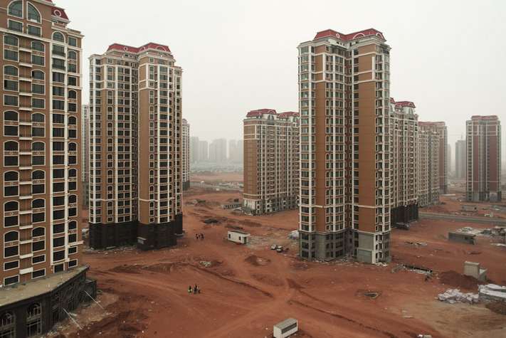
How to Bring China's Ghost Towns Back to Life

In this article, originally published in Metropolis Magazine's Point of View blog as "The Real Problem with China's Ghost Towns" , author Peter Calthorpe explains the problems of these cities, predicts their grim future, and explores how the thoughtful planning behind the city of Chenggong could provide a more sustainable alternative.

We’ve all seen the reports on “ghost town” developments in China, showing acres of empty high-rise apartments and vacant shopping malls. These barren towns seem particularly ironic in a country planning to move 250 million people from the countryside to cities in the next 20 years. But this massive, unprecedented demand has been distorted by a number of factors unique to China. Flawed financial incentives for cities and developers, along with the poor phasing of services, amenities, and jobs create most of the problems. In addition, China’s emerging middle class is very comfortable (perhaps too comfortable) investing in real estate, so people often buy apartments in incomplete communities but don't move in, expecting that values will rise, or that they will live there someday. The result is a string of large, empty developments that remain speculative investments rather than real homes and communities. [See-through buildings are the worry now, but the real problems may come when they are full.]

While it’s hard to get data on vacancy levels in China, there are certainly many anecdotal examples across the country. An all-too-typical example is Chenggong, the new town planned for 1.5 million just outside of Kunming in the west. This freshly minted city boasts the growing Yunnan University, currently with 170,000 students and faculty; a new government center; and an emerging light industrial area. Under construction are the city’s new high-speed rail station and two metro lines connecting the historic city center.

Vanity Height: How Much of a Skyscraper is Usable Space?

Ever expanding population growth coupled with the continuous development of urban centres mean that buildings, in general, will continue to get taller. With the topping out of One World Trade Centre in May this year the worldwide competition to construct towers with soaring altitudes doesn’t seem to be slowing, especially in China and the UAE. The question on many people’s lips, however, is how much of these colossal buildings is actual usable space?

Parasite or Savior? Ibelings van Tilburg's Hovering New High-Rise

This article originally appeared in uncube magazine as "Saviour or Parasite?"

The post-war city centre of Rotterdam is ruled by commerce. Only five percent of the city's inhabitants live in the centre, which is almost entirely occupied by highstreet fashion chains, fast food restaurants, and offices. After shop closing time, the shutters go down and the streets are deserted. The municipality would like to lure more inhabitants into the centre – but space for new residential buildings is scarce. So in recent years, a 1960s cinema and church had to make way for a huge new housing complex designed by Alsop Architects, and a residential tower by Wiel Arets was speedily attached to Marcel Breuer's department store, De Bijenkorf. It was not until the municipality suggested forcing new housing high-rises into the green courtyards of the Lijnbaanhoven residential complex, designed in 1954 by Hugh Maaskant, that there were protests and the project had to be cancelled. For the time being, that is.

One densification project, however, tried not to destroy or debase the post-war building originally occupying its site. In many respects, the Karel Doorman residential high-rise could even be called the saviour of the old Ter Meulen department store. It might be rather uncommon for a valiant hero to crouch down on the shoulders of the little old lady he intends to rescue – but that's more or less what happened here.

Ask Arup: What Are the Best Ways to Use 3ds Max in Visualizations?

This article originally appeared on Arup Connect as "Ask Arup: Visualization Edition."

For our latest round of Ask Arup, ArchDaily reader Biserat Yesflgn requested tips for visualization software 3ds Max (formerly known as 3D Studio Max). We spoke to New York-based Arup visualization specialist Anthony Cortez to find out how he uses the program, what skills prospective visualization artists need, and how the field is evolving.

Unified Architectural Theory: An Introduction

In the following months, we at ArchDaily will be publishing Nikos Salingaros' book, Unified Architectural Theory, in a series of installments, making it digitally, freely available for students and architects around the world. In the following paragraphs, Salingaros explains why we've decided to impart on this initiative, and also introduces what his book is all about: answering "the old and very disturbing question as to why architects and common people have diametrically opposed preferences for buildings."

ArchDaily and I are initiating a new idea in publishing, one which reflects the revolutionary trends awaiting book publishing's future. At this moment, my book, Unified Architectural Theory, 2013, is available only in the USA. With the cooperation of ArchDaily and its sister sites in Portuguese and Spanish, it will soon be available, in a variety of languages, to anyone with internet access. Being published one chapter at a time, students and practitioners will be able to digest the material at their leisure, to print out the pages and assemble them as a "do-it-yourself" book for reference, or for use in a course. For the first time, students will have access to this material, in their own time, in their own language, and for free!

The book itself arose from a lecture course on architecture theory I taught last year. Students were presented with the latest scientific results showing how human beings respond to different types of architectural forms and spaces. At the end of the course, everyone was sufficiently knowledgeable in the new methods to be able to evaluate for themselves which buildings, urban spaces, and interior settings were better suited for human beings. 

This approach is of course totally different from what is now known as “Architectural Theory.” 

Welcome to the Wellness Center: A New Breed of Recreation Design

Welcome to the Wellness Center: A New Breed of Recreation Design - Image 5 of 4
The Student Wellness & Recreation Center at Georgia College & State University. Image Courtesy of JWest Productions

Until recently, student health and counseling services have predominantly been offered independently of athletics and recreation. But as institutions contemplate a more unified approach to health and wellness, the boundaries of these traditionally separated campus services are becoming blurred. Many believe that unifying these various programs and services under one roof is in the best interest of their students’ long-term health, as well as a potential budgetary and operational boon. 

This recent shift in mindset has supported the emergence of a new breed of recreation centers that is only anticipated to multiply. “We’re seeing more and more universities come to us with a new set of challenges and program needs, as opposed to simply saying ‘we need this type of building,” says Brad Lukanic, Cannon Design’s executive director of education.

More on this new breed of Wellness Center, after the break...

Bold New Suburbia: Meet The Architects Daring to Better the 'Burbs

This article originally appeared the National Endowment of the Arts' quarterly magazine as "The Suburban Canvas: An Emerging Architectural Model of Artistic Possibilities"

For much of its existence, American suburbia has been considered an architectural wasteland. From shopping malls to McMansions to residential developments, suburbs from Connecticut to California look eerily similar and share a similar pattern of quick, cheap construction that has left little if any room for thoughtful design.

But with the recent foreclosure crisis and growing environmental concerns, new opportunities have emerged to re-imagine the suburbs into sustainable, architecturally innovative communities. Although the other art forms examined in this issue have fully established themselves, suburban design -- traditionally the realm of profit-driven developers -- is only now beginning to emerge as an artistic field. Fueled by exhibits such as the Museum of Modern Art's Foreclosed: Rehousing the American Dream and Dwell magazine's Reburbia Design Competition, architects and designers are beginning to explore what the suburbs could potentially look and feel like. We spoke with several architects who are leaders within this growing trend, and are quite literally designing new artistic possibilities for all those "little boxes on the hillside." In their own words, here are some of their concerns, projects, and visions.

AD Architecture School Guide: Carnegie Mellon University

At Carnegie Mellon University’s School of Architecture, prospective students are likely to find a course of study that will interest them. The School’s newly revised undergraduate curriculum allows students to choose studios in their 4th and 5th year that concentrate on breadth or depth in the following topics of interest: Sustainable Design, Digital Design, Management and Critical Practice, Design/ Build, Urban Design, and Future Studios. For example, students interested in digital fabrication, computational design, and new materials may choose to concentrate in Digital Design.

Light Matters: Recovering The Dark Sky

The advent of electrical lighting has allowed us to colonise the night. Not only have kilometres of street lighting ensured higher levels of safety, but signs, advertisements, etc. continue to draw us into nocturnal landscapes. As Rem Koolhaas explored in Delirious New York, Manhattan and Coney Island were the early luminous prototypes for today’s continuously vibrant metropolises: cities that establish new rhythms, a new balance between work and life. 

But what happens when lighting upsets our natural balance? When we lose the beauty of the dark sky, the stars? What happens when lighting turns into pollution? 

More Light Matters, after the break...

You've started following your first account!

Did you know?

You'll now receive updates based on what you follow! Personalize your stream and start following your favorite authors, offices and users.