1. ArchDaily
  2. Articles

Articles

Five Fantastical Examples of Speculative Architecture

This Article by Avinash Rajagopal originally appeared in Metropolis Magazine as "Five Compelling Works of Architecture Fiction". Rajagopal argues in favor of the often dismissed genre of 'architecture fiction', giving five recent examples of the best the field has to offer.

As far as we know, the writer Bruce Sterling coined the term “architecture fiction,” in 2006. He was referring, of course, to speculative projects in which architects use ideas for the built environment to express themselves in a way that’s analogous to how storytellers use words. It’s a longstanding architectural tradition. Sterling cites the polemic work of the 1960s British group Archigram; the canon includes Lebbeus Woods’s drawings from the two decades that followed and Greg Lynn’s digital imaginings (one of which accompanied a short story by Sterling, in Metropolis’s 2003 Fiction Issue).

In the last few years, we have seen a groundswell in the genre. The usual reason given to explain the profusion of these fictitious works is that the recession made it hard for young architects to find “real” work, but there are probably other factors at play. Ethical concerns are back in the zeitgeist for a contradictory generation that’s equally into Occupy Wall Street, iPhones, and hipster shops selling single-source coffee. Their utopias and dystopias are more easily imagined with 3DS Max and Photoshop, and far more quickly disseminated online. All of this has made for some pretty rich storytelling.

Commenters on blogs still rail about the “uselessness” of architecture fiction. To answer them would be akin to mounting a defense of the short story—one surely could, but it would be a self-defeating exercise. The very nature of fiction is to be less bothered with usefulness than with possibility. In that spirit, here are five recent projects that I found compelling, in both imagery and the stories they attempt to tell.

Rise of The New Radical Pragmatist

Using Australia as her focus, Marissa Looby, in a recent article for the Australian Design Review, argues that the disappearance of architectural styles, combined with the proliferation of various guidelines and building codes, has created a new breed of architect: The New Radical Pragmatist. Her article "The New Radical Pragmatist (On Validation)" is reprinted here.

The Architectural Review (December, 1955) first published Reyner Banham’s epochal and pivotal article, ‘The New Brutalism’, in which the critic pointed to the rise of a new architectural style. He also described an influx of -isms that were becoming increasingly conspicuous to the discipline, stemming from the then contemporary model of an art historian and their influence on the architectural historian-as-observer of the architectural profession. Banham incisively suggested that any proposition of the term ‘new’ has an unequivocal relationship to the past, so much so that in advocating for a new -ism an architectural theoretician must defend their claim with historic fact. Ironically, Banham acknowledged that even ‘The New Brutalism’ title derived from The Architectural Review’s analysis of the International Style in the postwar article, ‘The New Empiricism’. He stated: “[the] ability to deal with such fine shades of historical meaning is in itself a measure of our handiness with the historical method today, and the use of phrases of the form ‘The New X-ism’ – where X equals any adjectival root – became commonplace in the early 1950s in fourth year studios and other places where architecture is discussed, rather than practised.”

Light Matters: Glass Beyond Transparency with James Carpenter

In Modernism’s attempt to dissolve spatial boundaries with transparency, the material used - glass - is all too often dematerialised. In contrast, the New York-based designer James Carpenter is interested in multiple readings of glass - beyond transparency.

As Carpenter explains: “People approach light in relationship to architecture. It is that the light is the means by which the architecture is revealed and the architecture is basically defined by the way the light enters the space. I tend to think actually from the opposite direction where the light itself is what informs the architecture. The architecture is in service of light rather than the other way around.” 

More Light Matters, after the break…

Light Matters: Glass Beyond Transparency with James Carpenter - Image 1 of 4Light Matters: Glass Beyond Transparency with James Carpenter - Image 2 of 4Light Matters: Glass Beyond Transparency with James Carpenter - Image 3 of 4Light Matters: Glass Beyond Transparency with James Carpenter - Image 4 of 4Light Matters: Glass Beyond Transparency with James Carpenter - More Images+ 12

What Will Be Mandela’s Spatial Legacy?

What Will Be Mandela’s Spatial Legacy? - Featured Image
Rendering for Greenpoint Stadium. Image Courtesy of http://bensnewgreenpointstadium.webs.com/

From the window of an airplane it's all too plain that apartheid has been deeply written into the South African landscape. Even the smallest town appears as two distinct towns. One features a spacious grid of tree-lined streets and comfortable houses surrounded by lawns. The other, its shriveled twin, some distance away but connected by a well-traveled road, consists of a much tighter grid of dirt roads lined with shacks. Trees are a rarity, lawns non-existent. This doubling pattern appears no matter the size of the population: here, the white town; over there, the black township. -- Lisa Findley, “Red & Gold: A Tale of Two Apartheid Museums.”

There are few systems of government that relied so heavily upon the delineations of space than the Apartheid government of South Africa (1948-1994). Aggressively wielding theories of Modernism and racial superiority, South Africa’s urban planners didn’t just enforce Apartheid, they embedded it into every city - making it a daily, degrading experience for South Africa’s marginalized citizens.

When Nelson Mandela and his party, the African National Congress, were democratically elected to power in 1994, they recognized that one of the most important ways of diminishing Apartheid’s legacy would be spatial: to integrate the white towns and the black townships, and revive those “shriveled twin[s].”

As we remember Mandela - undoubtedly the most important man in South Africa’s history - and ponder his legacy, we must also consider his spatial legacy. It is in the physical, spatial dimensions of South Africa’s towns and cities that we can truly see Apartheid’s endurance, and consider: to what extent have Mandela’s words of reconciliation and righteous integration, truly been given form?

New York City in 2050 (Twenty-Seven Predictions)

As we celebrate the 25th anniversary of Arup’s New York office, we’ve spent the past few months talking with people inside the firm and beyond about the future of the city. We asked them to come up with blue-sky ideas about the New York of 2050 without worrying too much about financial or political feasibility. Circumstances can change a great deal over almost four decades, after all, and tomorrow’s constraints might look very different than today’s. We then worked with graphic designerJosh Levi to synthesize and visualize the results — view the large version here. Our main goal: to spark conversations about long-term priorities for the city and possible ways to achieve them.

What would you add to the list? How would you change it?

Read all 27 predictions, after the break...

Happy Birthday Lina Bo Bardi!

“Architecture is created, 'invented anew,' by each man who attempts her, who roams her space, climbs a stair, rests on a balustrade, lifts his head to look, open, close a door, who sits down or gets up and makes intimate contact with - and at the same time create 'forms' in - the space [...] This intimate, fiery, contact, that which was perceived by man at the beginning, is today forgotten. Routine and communal places made man forget the natural beauty of "moving in space," of his conscious movement, of those little gestures…” -- Lina Bo Bardi

We're celebrating the life and work of renowned Italian-Brazilian architect, Lina Bo Bardi, who would have turned 99 today.

Discover more about this icon and proponent of humanist modern architecture, after the break...

Why It's Time to Give Up on Prefab

This article by Chris Knapp, the Director of Built-Environment Practice, originally appeared on Australian Design Review as "The End Of Prefabrication". Knapp calls for the end of prefabrication as a driver for design, pointing out its century-long failure to live up to its promise, as well as newer technology's ability to "mass produce difference".

Prefabrication – there is not another word in the current lexicon of architecture that more erroneously asserts positive change. For more than a century now, this industrial strategy of production applied to building has yielded both an unending source of optimism for architecture, and equally, a countless series of disappointments. This is a call for the end of prefabrication.

Read on after the break

The Gherkin: How London’s Famous Tower Leveraged Risk and Became an Icon (Part 4)

This four part series (originally published on Aggregate’s website) examines the Gherkin, the London office tower designed by Foster + Partners, showing how the urban icon engaged and leveraged perceptions of risk. In part one, author Jonathan Massey introduced the concept of "risk design” to describe how the Gherkin’s design managed the risks posed by climate change, terrorism, and globalization. In parts two and three, Massey examined the building’s treatment of risks associated with climate change and terrorism. In this final installment, Massey concludes by addressing the building’s engagement with risks posed to the City of London by globalization.

Unlike New York and other cities in which zoning codes entitle landowners to some kinds of development “as of right,” the City of London regulates property development through case-by-case review by planning officers, who judge how well the proposed construction conforms to City-wide plans and guidelines regarding factors such as building height, development density, access to transit, and impact on views and the visual character of the area. In order to develop the Gherkin, the property owners and Swiss Re had to secure planning consent from the City Corporation through its chief planning officer, Peter Wynne Rees. The review and permitting process that culminated in the granting of planning consent in August 2000 spanned the planning office as well as the market, the courts, and the press. Rees brokered a multilateral negotiation so intensive that we could almost say the building was designed by bureaucracy. Part of that negotiation entailed imagining and staging risk: climate risk, terrorism risk, and, especially, the financial risks associated with globalization.

For Architects Only? How Kanye Exposed Architecture's Bias

For Architects Only? How Kanye Exposed Architecture's Bias - Image 2 of 4
© Noam Dvir, Instagram User dvirnm

When Kanye West spoke with students at my alma mater on Sunday evening, he said “I really do believe that the world can be saved through design, and everything needs to actually be ‘architected.’” In the social media frenzy that followed, a recurring response that I saw on architecture-centric sites was to snicker at West’s use of the word “architect” as a verb. For many, this was symbolic of West’s ignorance and hubris as he presumed to talk about something without knowing anything.

Except, of course, that “architect” is well recognized as a verb. Dictionaries say so, architects say so, and academics say so. If you’re architect Doug Patt and call yourself howtoarchitect on YouTube, you get a contract from MIT Press to write a book—called How to Architect. If you are the French philosopher Louis Marin, you can suggest that “the castle and gardens of Versailles ‘architect’ the Prince to make him not only the absolute of political power, but the center of the cosmos in its entirety,” and you will be counted among the most eminent semioticians of the twentieth century. If you are Harvard architecture theorist K. Michael Hays, you might stand up at an academic conference and say, “There are only certain things that can be done at this moment. Not just anything can be architected at this moment, right? There are limits.” When you do, people will nod and applaud.

But if you are Kanye West and you suggest that “everything needs to actually be ‘architected,’” it disqualifies you to speak about architecture.

Piano Takes on Kahn at Kimbell Museum Expansion

For architects, Louis Kahn's Kimbell Museum has long been hallowed ground. For Renzo Piano, who designed the museum's first major expansion, it was also an enormous difficulty to overcome. His addition to the museum could be neither too close to Kahn's building, nor too far. It had to solve a parking problem, yet respect Kahn's distaste for cars. It had to respond to Kahn's stately progression of spaces—and that silvery natural light that make architects' knees go wobbly. And yet it could not merely borrow from Kahn's revolutionary bag of tricks.

Why Japan is Crazy About Housing

Japan is famous for its radical residential architecture. But as Tokyo architect Alastair Townsend explains, its penchant for avant garde housing may be driven by the country’s bizarre real estate economics, as much as its designers’ creativity.

Here on ArchDaily, we see a steady stream of radical Japanese houses. These homes, mostly designed by young architects, often elicit readers’ bewilderment. It can seem that in Japan, anything is permissible: stairs and balconies without handrails, rooms flagrantly cast open to their surroundings, or homes with no windows at all.

These whimsical, ironic, or otherwise extreme living propositions arrest readers’ attention, baiting us to ask: WTF Japan? The photos travel the blogosphere and social networks under their own momentum, garnering global exposure and international validation for Japan’s outwardly shy, yet media-savvy architects. Afterall, in Japan – the country with the most registered architects per capita – standing out from the crowd is the key to getting ahead for young designers. But what motivates their clients, who opt for such eccentric expressions of lifestyle?

Why Japan is Crazy About Housing - Image 1 of 4Why Japan is Crazy About Housing - Image 2 of 4Why Japan is Crazy About Housing - Image 3 of 4Why Japan is Crazy About Housing - Image 4 of 4Why Japan is Crazy About Housing - More Images+ 4

The Indicator: What Goes Up Does Not Come Down

We all know what architecture critic Banksy thinks about 1 World Trade Center. He infamously called it a “shyscraper” in an op-ed piece the New York Times declined to publish. But that hasn’t stopped the article from circulating and pissing New Yorker’s off. In true Banksy form you can find it on his website, mocked up to appear like a front page headline.

In it, he writes, “It reminds you of a really tall kid at a party, awkwardly shifting his shoulders trying not to stand out from the crowd. It’s the first time I’ve ever seen a shy skyscraper.” Of course, this didn’t stop the Council on Tall Buildings and Urban Habitat (CTBUH) from recently celebrating it as the tallest building in this here United States of America. Yippee ki-yay!

But- who cares? New York has many other things going on urbanistically and architecturally that render tallness less significant than it used to be, if not outright pointless. Infrastructural interventions of the more horizontal sort, a la the High Line for example, seem far more significant. In the face of real urban complexity and uneven development, grasping for tallness is a simplistic go-to, while the real problems remain down on the street, unrelated to air rights, view corridors, sunlight access angles, and blocked horizons. 

And yet cities of the world continue to privilege tall towers as icons of economic and political might. 

Can We Please Stop Bashing Architects?

If the discussions recently held at the Battle of Ideas are any indication, it seems that we in the architecture community are living a certain crisis of confidence.

Not one new utopian vision has been presented in the past 30 years, lamented Theodore Dounas; all these pop-ups popping up are just evidence, said Pedro Bismarck and Alastair Donald, of architecture's fearful reluctance to tackle  complex problems or act as a legitimate agent for change at all; and then there’s the problem, voiced by Rory Olcayto, of architects being bullied by their clients into executing questionable agendas.

The Gherkin: How London’s Famous Tower Leveraged Risk and Became an Icon (Part 3)

This four part series (originally published on Aggregate’s website) examines the Gherkin, the London office tower designed by Foster + Partners, showing how the urban icon engaged and leveraged perceptions of risk. In part one, author Jonathan Massey introduced the concept of "risk design” to describe how the Gherkin’s design managed the risks posed by climate change, terrorism, and globalization. In part two, Massey examined the building’s treatment of climate risk. In part three, below, he explains how the Gherkin redesigned the risk imaginary associated with terrorism.

Mornings the Zamboni scrubs the plaza. Moving across the pavement in parallel lines connected by tight turns, the sweeper cleans the stone of cigarette butts and spilled food and beer left the night before by the underwriters and bankers who patronize the bar and shops in the building’s perimeter arcade as well as the adjacent restaurant that in fair weather sets up outdoor tables and chairs.

By pulling away from its irregular property lines, the tower achieves almost perfect formal autonomy from its context. The gap between the circular tower base and trapezoidal site boundaries forms a privately owned public space, a civic and commercial amenity in this densely built part of the City. 

ArchitectureBoston's Latest Issue Tackles Coastal Vulnerability

The new issue of ArchitectureBoston magazine, Coast, focuses on the thin border of continental crust that is home to 45 percent of the world’s population. The issue examines how architects and urban planners can mitigate or accommodate sea-level rise and storm surges associated with climate change. Coast promotes debate and offers answers and opportunities surrounding a problem that will inevitably affect most of the world’s urban residents in years to come.

Substances of Concern: Why Material Transparency Matters

The materials we select and specify to make up our buildings have a real meaningful impact on human health and the environment. Unfortunately, due to a lack of material transparency, that impact is frequently negative, damaging the environment and harming populations across the globe.

In February of this year, Chinese authorities were forced to face the tragic facts and admit that “cancer villages” existed in areas where harmful chemicals, many of which are banned in developed nations, are prevalent in current manufacturing processes. There are many that believe these chemicals are contributing to make cancer the number one killer in China, surpassing cardiovascular disease.

The Gherkin: How London’s Famous Tower Leveraged Risk and Became an Icon (Part 2)

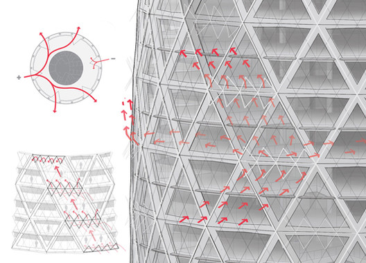
This four part series (originally published on Aggregate’s website) examines The Gherkin, the London office tower designed by Foster + Partners, showing how the urban icon engaged and leveraged perceptions of risk. In part one, author Jonathan Massey introduced the concept of "risk design” to describe how the Gherkin’s design managed the risks posed by climate change, terrorism, and globalization. In part two, below, Massey examines the Gherkin’s enclosure and ventilation systems in detail to explain how the building negotiated climate risk.

In a poster promoting London’s bid to host the Olympic Games, the Gherkin supported gymnast Ben Brown as he vaulted over the building’s conical peak. The image associated British athleticism and architecture as complementary manifestations of daring and skill, enlisting the Gherkin as evidence that London possessed the expertise and panache to handle the risk involved in hosting an Olympic Games.

But a poster created three years later offered a very different image. Created by activists from the Camp for Climate Action to publicize a mass protest at Heathrow Airport against the environmental degradation caused by air travel, this poster shows the Gherkin affording only precarious footing to a giant polar bear that swats at passing jets as its claws grasp at the slight relief offered by spiraling mullions and fins.

Unified Architectural Theory: Chapter 3

We will be publishing Nikos Salingaros’ book, Unified Architectural Theory, in a series of installments, making it digitally, freely available for students and architects around the world. The following chapter posits that architecture's geometric structure determines its "vitality," a quality that should be the basis of architectural critique; it also explains If you missed them, make sure to read the introduction, Chapter One, Chapter 2A, and Chapter 2B first.

The perceived quality of life in buildings and urban spaces comes from the geometry (the form of structures on all scales, and their coherence), and how that geometry connects to the individual. It also catalyzes interactions among people — if it is done successfully.

The easiest way to perceive this quality of “life” is to compare pairs of objects or settings and judge intuitively which one has more “life”. After a series of such experiments, it becomes obvious that degree of “life” in architecture arises from geometrical structure.

Does the Title of "Architect" Deserve To Be Protected?

In August, the AIA posted a topic on its LinkedIn discussion board entitled "Misrepresenting Oneself as an Architect on LinkedIn". Ever since (and once again), the issue of protecting the title of "Architect" has been a hot topic, as explained in this article on Fast Company. This follows the revelation in BD last year that the Architects' Registration Board ordered the British architectural media to cease referring to Renzo Piano and Daniel Libeskind as Architects. With the topic appearing so frequently, and in different countries each time, Fast Company conjures images of a "raging global debate". But what, really, is going on in the world of architecture to fuel such a debate? Read on to find out more.

The Gherkin: How London's Famous Tower Leveraged Risk and Became an Icon

How does design change the nature and distribution of risk? In this, the first of four installments examining the Gherkin, the London office tower and urban icon designed by Foster + Partners, author Jonathan Massey introduces the concept of “risk design.” The series, originally published on Aggregate's website, explains how the Gherkin leveraged perceptions of risk to generate profits, promote economic growth, and raise the currency of design expertise.

Designing Risk

Back the Bid. Leap for London. Make Britain Proud. Emblazoned across photomontages of oversized athletes jumping over, diving off, and shooting for architectural landmarks old and new, these slogans appeared in 2004 on posters encouraging Londoners to support the city’s bid to host the 2012 Olympic Games. Featured twice in the series of six posters—along with Buckingham Palace, Nelson’s Column, the Tower Bridge, the London Eye, and the Thames Barrier—was 30 St Mary Axe, the office tower known colloquially as the Gherkin for its resemblance to a pickle, or as the Swiss Re building, after the Zurich-based reinsurance company that commissioned the building and remains its major tenant.

London Calling: The Man Behind the Stirling Prize

A few weeks ago the RIBA doled out the 18th Stirling Prize to London-based architects Witherford Watson Mann. The decision was a good one. It was good for WWM and good for the profession – a youngish practice being recognized for a small but beautiful piece of work.

The scheme’s application of brickwork and joinery removes the work from the expediencies of modern construction technology and building products, which almost exclusively characterize the contemporary built environment. It genuinely feels like a project made at a different point in history, the result of the quite particular interests of three minds, Stephen Witherford, Chris Watson and William Mann. It is direct and personal. It reminds me of Stirling’s work.. 

And not just for its powerful draftsmanship, plan and restricted palette of materials, but for its intimacy. An intimacy that is apparent in much of Stirling’s oeuvre. I do not refer to the production of intimate spaces per se but the formulation of an architecture that is authored not by a factory but a few minds. 

The latest Stirling prompted me to look back, and reconsider the work of Stirling himself.

Museu Brasileiro de Escultura (MuBE) / Paulo Mendes da Rocha

Keep an eye out, or you might miss the Museu Brasileiro de Escultura (a.k.a. MuBE, pronounced MOO-bee). Widely considered the masterpiece of Pritzker Prize-winner Paulo Mendes da Rocha, the building was in fact born out of the desire to have no building at all. When in the 1980s an empty lot in Sao Paulo's mansion-laden Jardins district was slated to become a shopping mall, wealthy residents successfully lobbied to create a public square instead. To sweeten the deal and ensure the land stayed commercial-free, they hired Mendes de Rocha to create MuBE. Completed in 1995, the 7000-sq-meter museum hunkers down beneath ground level, thus preserving what in Sao Paulo is that rarest of luxuries: a public green space.

Cities are for People: Turning Underused Spaces into Public Places

It begins with a fundamental premise: Buildings occupy only a fraction of land in cities. Just as important as physical structures, are the public spaces in between.

In many cities these spaces have long been disregarded. Today, however, we are witnessing bold experimentation and innovation coming forth from cities across the globe: cities re-using and re-imagining previously underused spaces in order to uplift communities and transform lives. 

Light Matters: Europe's Leading Light Festivals

In mid autumn, when the nights get longer in the northern hemisphere, we encounter numerous light festivals. And indeed, within the last ten years, more and more light festivals have globally emerged. The reason for the success of light festivals is simple, as the German curator Bettina Pelz concludes: “It’s actually fairly easy, because whenever you do something with light in cities in the night, then people do come. If you do it good, they come twice.” 

As Pelz points out, light is an apt medium for evening events, since it easily attracts people. Communities have discovered the potential of lighting for city marketing, and the closer they plan their date to Christmas, the more they merge their illumination with the festive blinking lights of commercial Christmas markets.

Join us on a tour through some of the leading light festivals in Europe. Read more about their different backgrounds, artistic concepts and future trends after the break...

Light Matters: Europe's Leading Light Festivals - Featured ImageLight Matters: Europe's Leading Light Festivals - Image 1 of 4Light Matters: Europe's Leading Light Festivals - Image 2 of 4Light Matters: Europe's Leading Light Festivals - Image 3 of 4Light Matters: Europe's Leading Light Festivals - More Images+ 25

You've started following your first account!

Did you know?

You'll now receive updates based on what you follow! Personalize your stream and start following your favorite authors, offices and users.