1. ArchDaily
  2. Articles

Articles

The Fear Sustaining Sustainable Urbanism

In this article, originally published on the Australian Design Review as "Longing For a Greener Present", Ross Exo-Adams examines the fear that lies behind the trend toward sustainable urbanism, and finds that the crisis we find ourselves in might not only be confined to an ecological one.

Over the past decade, architects have found themselves increasingly commissioned to design districts, neighbourhoods, economic free zones and even entire new cities: a phenomenon that has been accompanied by a commitment to ‘sustainability’, which now seem inseparable from urban design itself. While ‘sustainability’ remains a vague concept at best, it nonetheless presents itself with a sense of urgency similar to that which galvanised many of the great movements of modern architecture vis-a-vis the city. Underlying such urgency is a rhetorical reference to a collective fear of some palpable sort, whether it be fear of revolution (Le Corbusier), fear of cultural tabula rasa (Jane Jacobs, Team X) or our new fear: ecological collapse. It is obvious that the myriad ‘eco’ projects that have popped up all around the world would not be viable if not for the fact that they appear against a background of imminent catastrophe – a condition of terrifying proportions. Yet the essence of this fear is far from clear. Indeed, in light of ecological catastrophe and amidst any fetish for windmills or vegetation, architects have cultivated what seems to be a curious nostalgia for the present – a pragmatism whose lack of patience for the past seeks a kind of reconstitution of the present in imagining any future. So if not for climate mayhem, what is the true nature of fear that lies at the core of today’s urban project, ‘ecological urbanism’?

Find out after the break

A Case for the Democratization of Architectural Media

In October Phineas Harper, assistant editor of The Architectural Review, published an article about the state of architectural publishing, in which he addressed the crisis facing traditional architectural publishers and heavily criticized online platforms, particularly ArchDaily, that have “little time for critique, turning instead to reworking press releases and biased descriptions from the architects.”

Allow me to introduce myself: I am a critic and creator of original content for ArchDaily, and I would like to refute these allegations.

How Should We Implement Smart Cities?

In this article, originally published by Arup Connect as "Anthony Townsend on Smart Cities", Townsend discusses his book "Smart Cities: Big Data, Civic Hackers, and the Quest for a New Utopia" and explains how, in his view, the push towards smart cities is being led by the wrong people - namely technology companies with short term goals; the architects, planners and scientists who should be leading this change, however, often struggle to share their knowledge.

Your book argues that there's a need for grassroots action rather than top-down, corporate-led implementation of smart cities. How do you see architects and engineers fitting into this picture?

Architects and engineers for the most part have to serve the interests of their clients. There's a balance that has to be struck, almost on a project-by-project basis, about how much they can push back in saying a piece of technology related to the business model for the project, or even a placemaking strategy, has unintended consequences, or that there may be a more democratic or innovative approach.

A lot of the vision of smart cities has been shaped by IT engineers and marketers. The problem there is not just that it's sort of a naïve vision being pushed by companies with very short-term sales goals. It just doesn't appreciate the complexity of good urbanism, and the role that both communications and information play in creating good places that people want to buy, work, live in.

Read more about the challenges facing smart cities after the break

Robert A.M. Stern on His Latest Publication: The "Definitive Text" on Suburbia

In this interview, originally published in Metropolis Magazine as "The Charms of Suburbia", Martin Pedersen interviews Robert A.M. Stern about his new book, "Paradise Planned: The Garden Suburb and the Modern City". Pedersen's interview delves into the history behind the Garden Suburb - a typology that is distinct from the stereotype of suburban sprawl.

Robert A.M. Stern is nothing if not counterintuitive. How else do you explain—in an increasingly digital and urban-centric world—his recently released book, a 1,072-page tome, containing more than 3,000 images, on the history of the garden suburb? Paradise Planned: The Garden Suburb and the Modern City (the Monacelli Press, 2013) was written with longtime, in-house collaborators David Fishman and Jacob Tilove, who also worked with Stern on the fifth volume of the architect’s epic New York series.

Paradise Planned is similarly expansive. “The book grew like Topsy,” Stern says. “We’d think we had all the examples down, and a new one would pop up. So it just got bigger and bigger. And I thought: if we’re going to do this book, we really ought to do it as the definitive text. Now, it’s not forever text. People will always be adding things. But this is a pretty comprehensive view.” I recently talked to Stern about his new book, the folly of “landscape urbanism,” and the lessons learned from the garden suburb.

Read on for the rest of the interview

Kikutake's Sky House: Where Metabolism & Le Corbusier Meet

In this article, first published in the Australian Design Review as "The Meeting of East and West: Kikutake and Le Corbusier", Michael Holt outlines the cross-fertilization of ideas that helped spawn the Japanese Metabolist movement, focusing on how Le Corbusier's ideals were key in the design of one of the movement's most enigmatic projects, Kiyonori Kikutake's Sky House.

Japanese architect Kiyonori Kikutake’s Sky House (1958) remains an exemplary project that defines the Metabolist agenda but, more significantly, underscores the notion that a single-family dwelling can be ideologically recursive and strategic. Kikutake, however, was not without a somewhat unlikely precedent in the renowned Le Corbusier.

Both architects established an order and method of working via their smallest designs – Kikutake in Sky House and Le Corbusier at Villa Savoye (1929) – and developed their notions through written accounts (Kikutake’s Metabolist Manifesto, 1960 and Le Corbusier’s Purist Manifesto, predating the built work, in 1918). Finally, each scales up their ideas to the level of the urban through Kikutake’s Tower-Shaped Community Project (1959) and Le Corbusier’s Urbanisme at Chandigarh, India (1953). To locate the origin of the influence, it is necessary to first examine Le Corbusier’s position as the figurehead of Congrès International d’Architecture Moderne (CIAM).

Read on for more about this unlikely chain of influence

Behind "Hy-Fi": The Organic, Compostable Tower That Won MoMA PS1's Young Architects Program 2014

This article, published by Metropolis Magazine as "Behind the Living's "100% Organic" Pavilion for MoMA PS1", goes behind the plans for this year's MoMA PS1 Young Architects Program's winning design, "Hy-Fi" - looking at the compostable eco-bricks which make the design possible.

"It all starts on local farms with waste corn stalks," says Sam Harrington of Ecovative, who will help build this year’s winning entry for the MoMA PS1 Young Architect’s Program. Hy-Fi, designed by the New York-based firm The Living, will be made of bricks that are entirely organic and ultimately, compostable. A good chunk of that material is corn stalks, stained clay-red with an organic dye from Shabd Simon-Alexander and Audrey Louisere . The rest is mycelium—mushroom roots to you and me—that will hold the corn stalks together as they cohere into a molded shape. The technology, developed by Ecovative in 2007, has so far been used as a packaging material. "But we love the chance to try something bold, and that’s what PS1 is all about," Harrington says.

Read more about the bricks behind Hy-Fi after the break

How 5 California Colleges Approach Campus Design

In this article, originally published in 2 parts on Metropolis Magazine as "Building a University: How 5 California Schools Approach Campus Design" (Part 1 & Part 2), Sherin Wing investigates how different Californian universities utilize the design of their campus to express and enable their differing missions.

A school is more than just the sum of its intellectual records. Its legacy is very much tied to a physical place: its campus. More than a mascot or a symbol, the design of a campus and the buildings that form it greatly contribute to a university's lasting identity.

The key, then, is how a school’s material identity advances its intellectual mission. For example, academic buildings often physically symbolize the type of scholarly exploration and research that takes place therein. Administrative centers, on the other hand, anchor the more idealistic work taking place in the lecture and science wings. At the same time, individual buildings can function collectively as didactic forums for the public, demonstrating such principles as energy and water-use efficiencies. Lastly, the circulation between the buildings themselves is important. Open green space, for instance, can accommodate crowds, lectures, and even protests, providing a counterpoint to the more stately, processional routes that crisscross a campus.

Clearly these are different, and at times conflicting, agendas. How are they ranked and pursued by individual universities? Five campus architects at different California universities reveal how similar factors work in concert to produce very different visions and results. For some the initial plan of a school continues to wield influence over future developments, while in other cases a commitment to architectural movements and types gives rise to an eclectic, flexible approach to campus design.

Find out how these 5 California Universities approach their architecture after the break

The A-Z of Brutalism

The Guardian’s Jonathan Meades has named the “incredible hulks” of Brutalism with a thought provoking A-Z list that ranges from Hans Asplund, who coined the term “nybrutalism,” to California’s fascination with Zapotec-like adornments in the 1960s. Read the list in full and discover why Quebec City, Yugoslavia’s Janko Konstantinov, and Danish architect Jørn Utzon are all considered incredible hulks here.

What the Guggenheim Should Consider Before Building in Helsinki

The Guggenheim is planning a new museum in Helsinki. The site is in the heart of the city, next door to the late 19th Century market hall and open-air market place, two minutes from Helsinki Cathedral. The project, therefore, has great landmark potential for the city. And many Finns are lured by this very potential, wanting to increase tourism and put their capital city more evidently on the world map. There has also been discussion in the country’s main newspaper Helsingin Sanomat about how Finns should welcome a more joyous and fun architecture.

Destination-creation and architecture as entertainment are certainly strong themes of our times. They were treated with great artistry by Frank Gehry with the Bilbao Guggenheim, opened in 1997. However, it’s important to remember that the Bilbao Guggenheim might best be considered a spectacular one-off. Mayors, politicians and world leaders have since sought, in perhaps too facile a way, to rebrand their cities and countries with iconic landmarks. There has been much talk of making cities “world class” through such architectural gestures, and yet much of this marketer’s fodder is wholly out of touch with what makes great architecture great.

London Calling: The 'Practical' Architect

Recently the Chancellor of the Exchequer George Osborne pledged £30 million towards Thomas Heatherwick’s Garden Bridge over the Thames. It was an easy offer to make towards a conspicuous piece of design by the author of the 2012 Olympic flame. Contrast this with the Education Secretary Michael Gove’s remarks about the contribution that our profession might make to schools: "We won't be getting Richard Rogers to design your school. We won't be getting any award-winning architects to design it, because no one in this room is here to make architects richer."

Together, these events indicate that our government does not understand our profession. Genius minds may be called upon to make exceptional contributions to a built environment that otherwise need not be exposed to such frivolity and impracticality. And yet, every day architects make practical decisions that lead to great buildings. It’s about time the politicians here in the UK and abroad listened to a very ‘practical’ profession.

A Master Architect's Surprising Obsession

Frank Lloyd Wright—perhaps the most influential American architect of the 20th century—was deeply ambivalent about cities. For decades, Wright was seen as the prophet of America's post-World War II suburban sprawl, yet the cities he imagined were also carefully planned, and very different from the disorganized landscapes that were often developed instead. Paradoxically, Wright was also a lifelong prophet of the race for height (think skyscrapers) that played, and continues to play, out around the world.

Sochi 2014: Asif Khan Greets Spectators with "Architectural Mount Rushmore"

The Olympics are in full swing and, although the "Coastal Cluster" of stadiums has attracted a considerable amount of attention, there is one installation demanding interaction from every spectator. Built at the entrance of Sochi's Olympic Park is Asif Khan Studio's "MegaFaces," a pavilion that "contorts itself to recreate 3D images of the faces of visitors relayed via digital face scans made in photo booths installed within the building."

Comprised of 11,000 actuators sitting underneath the cube's stretchy fabric membrane, the installation allows for three, eight meter tall faces to emerge from the wall at a time (the faces that emerge from the side of the pavilion are enlarged by 3500%). According to the designers, this feature of the building "has been likened to a giant pin screen and a digital, architectural Mount Rushmore."

OPINION: DS+R Should Have Resigned from the MoMA Commission

With all the controversy surrounding Diller Scofidio +Renfro (DSR) and MoMA's decision to demolish the American Folk Art Museum to make way for expansion, DS+R has increasingly come under fire (indeed, even DS+R's democratizing move to make the MoMA's sculpture garden accessible to the public has provoked considerable ire). In the following article, which originally appeared on Metropolis as "Damage Control," critic and author Martin Pedersen questions: why didn't DS+R just walk away?

A few weeks ago, in the wake of MoMA’s decision to raze the Folk Art Museum, the estimable Christopher Hawthorne of the Los Angeles Times asked ; why Diller Scofidio + Renfro (DSR) didn’t simply resign the commission, rather than recommend the demolition of a building designed by their (former?) friends. At the time, I was skeptical of the suggestion. But with the onslaught of negative publicity—which will continue up until the demolition of the building and perhaps well beyond—I’m beginning to think Hawthorne was right. And right not just from a moral, ethical and historic perspective.

INTERIORS: The Monthly Zine Mapping Film's Fascinating Spaces

Originally appearing on Metropolis as A Pair of Artists Use Architecture to Study Film, Colin Warren-Hicks profiles "Interiors", a monthly zine that analyzes important spaces in Films and TV through reconstructed architectural plans - and whose creators also contribute to Archdaily on a monthly basis.

Can a good film director be a good architect? That's the premise behind Interiors, a monthly online zine that critically investigates the link between film and architecture. Each issue breaks down, in architectural notation, a memorable set or scene from a movie or television series. (Lately, the subjects have expanded to include a Justin Timberlake music video and even a stage from Kanye West's Yeezus tour.) The diagrams are accompanied by a lengthy essay that supplements the spatial analysis.

Read more about "Interiors" - and see a collection of plans produced for the journal - after the break

INTERIORS: The Monthly Zine Mapping Film's Fascinating Spaces - Image 1 of 4INTERIORS: The Monthly Zine Mapping Film's Fascinating Spaces - Image 2 of 4INTERIORS: The Monthly Zine Mapping Film's Fascinating Spaces - Image 3 of 4INTERIORS: The Monthly Zine Mapping Film's Fascinating Spaces - Image 4 of 4INTERIORS: The Monthly Zine Mapping Film's Fascinating Spaces - More Images+ 5

Le Corbusier, Antoine de Saint-Exupéry, and Their Flights of Fancy

Le Corbusier, Antoine de Saint-Exupéry, and Their Flights of Fancy - Image 2 of 4
(Left) Antoine de Saint-Exupéry in Alghero, Sardinia, May 1944, (Right) Le Corbusier leaning against his Plan Voisin. Image © (Left) The John and Annamaria Phillips Foundation, (Right) Fondation Le Corbusier

This article by Avinash Rajagopal, originally published in Metropolis Magazine as 'The Little Prince' and Le Corbusier investigates the link between Le Corbusier and Antoine de Saint-Exupéry, writer of The Little Prince.

On October 22, 1929, a French architect got on the inaugural flight of the Aeroposta Argentina, a pioneering airline service that flew from Buenos Aires to Asuncion del Paraguay, flown by a French co-pilot. The act of flying would deeply influence the creative output of both passenger and pilot.

The former, of course, was Le Corbusier. The latter was Antoine de Saint-Exupéry, later to be famous as the creator of The Little Prince (1943), the well-beloved tale of a planet-hopping, fox-befriending, flower-loving space child.

Read on after the break for more about the pair

Should You Become a Global Architect?

Globalization has brought with it many things: the ability to travel, to recognize familiarity in any city, and, most importantly for us, to create trans-continental opportunity in design. It has created a platform for young professionals that no other generation has been fortunate enough to encounter at this scale. If you want to be a Global architect, to chase the award-winning projects, to work side by side with inspiring people, to learn from them and be amongst those at the top of their game, you have to be proactive and seek these people out; in essence, you have to be willing to be mobile.

Relocating for a career is not for everyone and not without risks (those will be covered later); however, having the opportunity to travel to a new city and learn a new skill set is an amazing experience we were both fortunate and proactive enough to capitalize upon. If that’s the kind of experience you seek, then maybe being a Global architect is right for you. Read on to know for sure.

European Prize of Architecture Philippe Rotthier

Established in 1982 by the architect Philippe Rotthier, this triennial prize rewards works of collective and cultural value with regional roots and using natural and sustainable materials that draw on the genius of the European town and a dialogue with the past and with history.

Behind the Magic of Media Installations

In this interview, originally published by Metropolis Magazine as "Q&A: Melissa Weigel of Moment Factory", Leslie Gallery-Dilworth talks with Weigel about the challenges of devising multimedia installations for public spaces, as in their recent installation for the Bradley International Terminal at LAX.

Montreal’s Moment Factory, a new media and entertainment studio, is best known for creating and producing multimedia environments that combine video, lighting, architecture, sound, and special effects. You may have seen their work at Cirque du Soleil, Madonna’s 2012 Superbowl Half Time Show, Disney's E3 booth, or Jay Z's Carnegie Hall debut. Perhaps you were there when they lit up the facade of the Sagrada Familia or Montreal's Quartier des Spectacles district. Or maybe you saw that they were included in Apple's recently launched 30th anniversary timeline.

Moment Factory was the main content provider for the interior concept and media features in the newly opened Bradley International Terminal at LAX, designed by Fentress Architects. It was a large collaboration consisting of several partners, including Mike Rubin with MRA International, Marcela Sardi of Sardi Design, Smart Monkey, Digital Kitchen, and Electrosonic with installation by Daktronics and Planar.

Can you prove that you will be the next great architect in just five days?

120 HOURS, - one of the worlds most important student competition, for and by architecture students, challenge you to redefine the meaning of sustainability in architecture. The catch; you only have five short days, and you have to convince OMA-partner Ellen Van Loon. Still up for it?

If you are so lucky as to find yourself with a job after you graduate school, the leap from student life to professional architect can be quite a challenge. From working on projects with deadlines many months down the line, to working day and night on proposals due “yesterday”. This is the harsh reality for most young professionals.

In 2010, three students at the Oslo School of Architecture wanted to create a new arena where Norwegian students could acquaint themselves with life as a professional architect. The result was the birth of the competition 120 HOURS.

Find out more after the break.

Case Studies in Coastal Vulnerability: Boston, Seoul, Hamburg, Bangladesh & New York

This article originally appeared in the latest issue of ArchitectureBoston as “Troubled Waters."

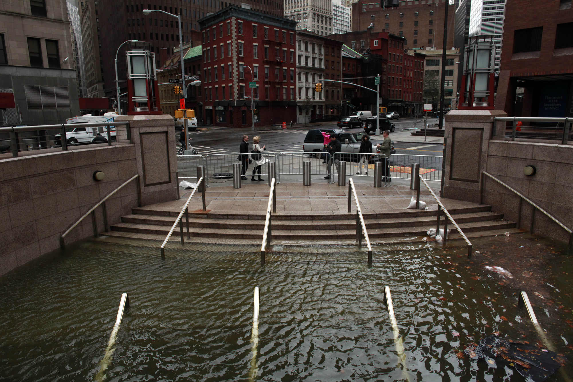
The challenges of sea-level rise cross boundaries of all sorts: geographic, political, social, economic. Proposed mitigation strategies will also necessarily shift and overlap. Here, we present five case studies from across the globe that offer intriguing ways—some operational, some philosophical—to address the threats associated with climate change. Drawing on a research initiative focused on vulnerabilities in Boston, a team at Sasaki Associates developed these additional design-strategy icons to illustrate the layered approaches. They are adaptable, the better to meet the unique demands of each coastal community.

Case Studies in Coastal Vulnerability: Boston, Seoul, Hamburg, Bangladesh & New York - Image 1 of 4Case Studies in Coastal Vulnerability: Boston, Seoul, Hamburg, Bangladesh & New York - Image 2 of 4Case Studies in Coastal Vulnerability: Boston, Seoul, Hamburg, Bangladesh & New York - Image 3 of 4Case Studies in Coastal Vulnerability: Boston, Seoul, Hamburg, Bangladesh & New York - Image 4 of 4Case Studies in Coastal Vulnerability: Boston, Seoul, Hamburg, Bangladesh & New York - More Images+ 6

Tourist Centre on Klekovaca Mountain International Competition

The purpose of the Competition is to obtain the preliminary urban and architectural design for the future urban zone of the Klekovaca Tourist Centre on Klekovaca Mountain. Klekovaca Mountain is located in the western part of Bosnia and Herzegovina and belongs to the central part of the Dinaric Arc - Southeast Europe region. Its highest peak is Velika Klekovaca (1.962m) and it stretches in a north-westerly to southeasterly direction, covering a distance of 43 km.

International Urban Design Ideas Competition - Trenčín – City on the River

Trenčín is currently facing changes connected with the relocation of the railway track directly within the city centre as part of the modernisation of the European railway corridor, with planned completion in 2016.

Light Matters: 7 Ways Daylight Can Make Design More Sustainable

Daylight is a highly cost-effective means of reducing the energy for electrical lighting and cooling. But architectural education often reduces the aspect of daylight to eye-catching effects on facades and scarcely discusses its potential effects - not just on cost, but on health, well-being and energy.

This Light Matters will explore the often unexplored aspects of daylight and introduce key strategies for you to better incorporate daylight into design: from optimizing building orientations to choosing interior surface qualities that achieve the right reflectance. These steps can significantly reduce your investment as well as operating costs. And while these strategies will certainly catch the interest of economically orientated clients, you will soon discover that daylight can do so much more.

More Light Matters with daylight, after the break…

How to Preserve Post-War Modernism

This article by Carlos Harrison appeared in Preservation Magazine as Reinvention Reinvented: Hope for Modernism, and discusses the issues surrounding the (increasingly popular) drive to preserve post-war modernism, including what we can learn from past successes and failures, and what it takes to preserve different types and styles of building.

Columbus, Indiana, is something of a modern marvel. It boasts more than 70 buildings by some of the architecture world’s greats, including titans of Modernism such as Eero Saarinen, I.M. Pei, and Richard Meier. Schools, churches, a library, a post office, and even a fire station stand as examples of the distinctively diverse architectural styles spanning the decades from World War II through Vietnam.

Crisp lines, sharp angles, connected like Lego blocks. Nearby: a 192-foot spire aims toward the heavens like a laser.

Read on after the break for more about preserving modernism

You've started following your first account!

Did you know?

You'll now receive updates based on what you follow! Personalize your stream and start following your favorite authors, offices and users.