1. ArchDaily
  2. Articles

Articles

London's Battersea Bridge Competition is a Symbol of a Divided City

The recent unveiling of the 74 entries to the Nine Elms to Pimlico Bridge competition was undoubtedly intended to cause a media circus, hoping to emulate the furore that surrounded the much larger Helsinki Guggenheim competition when they released all 1,715 of their entries to the web in October of last year. The competition, which asked designers to propose "one of the most expressive and visible landmarks in London," is the latest in a series of dramatic changes taking place on this stretch of the South Bank of the Thames. This new community, one of London’s most prestigious new neighbourhoods, includes Keiran Timberlake's new US Embassy and a slew of residential developments, culminating in the highly-touted renovation of Battersea Power Station, complete with accompanying buildings by Foster + Partners and Frank Gehry, and a public space by BIG.

Initial reactions to the competition entries has been mixed at best. The Guardian’s architecture critic Oliver Wainwright took the opportunity to poke light-hearted fun at a selection of designs, using his considerable powers of wordplay to dub entries with titles such as The Greenhouse Funhouse, The Spaffy Tangle, Razorwire Party Bridge, and The Flaming Mouth of Hades. Similarly, City Metric ran the news with an article titled “The 12 Most Ridiculous Designs for the New Battersea Bridge”, sparking a debate on Reddit in which users branded the projects "varying degrees of insane" and "ridiculous doodles." But beyond all this jovial name-calling, these designs are symptomatic of an unhealthy approach to wealth that London seems unable (or perhaps unwilling) to address.

London's Battersea Bridge Competition is a Symbol of a Divided City - Image 1 of 4London's Battersea Bridge Competition is a Symbol of a Divided City - Image 2 of 4London's Battersea Bridge Competition is a Symbol of a Divided City - Image 3 of 4London's Battersea Bridge Competition is a Symbol of a Divided City - Image 4 of 4London's Battersea Bridge Competition is a Symbol of a Divided City - More Images+ 5

Walkable Cities? Rooftoppers Want Climbable Cities

“The city for the people!” is the familiar rallying cry of the reformist architect - but which people, exactly? That’s the question at the heart of rooftopping, a new and thrill seeking variant of Urban Exploration which has recently captured the attention of the media. Spreading via social media outlets such as Instagram, the stunts draw attention by design, but why has coverage of the form of Urban Exploration climbed to such great heights?

Urban exploration has been at the fringes of the public consciousness since the mid 2000s as a form of punk sub-culture; anarchists poking around in sewer tunnels and proto-pinterest ruin exploration (although unsurprisingly the habit of people breaking into abandoned, closed off or normally inaccessible buildings dates back much, much farther). The way rooftopping has captured the public imagination, though, is as a form of public discourse: how it meshes with social media, the way corporate groups have attempted to market stunts, and the way these groups are interacting with the urban environment.

Walkable Cities? Rooftoppers Want Climbable Cities - Image 1 of 4Walkable Cities? Rooftoppers Want Climbable Cities - Image 2 of 4Walkable Cities? Rooftoppers Want Climbable Cities - Image 3 of 4Walkable Cities? Rooftoppers Want Climbable Cities - Image 4 of 4Walkable Cities? Rooftoppers Want Climbable Cities - More Images+ 2

Happy 25th Birthday Photoshop; Architecture Wouldn't be the Same Without You

This past week, Adobe Photoshop turned 25 years old. That’s right: at an age where us mere mortals are often still embarrassingly reliant on our parents, Photoshop is taking the opportunity to look back on how it became one of the world’s most ubiquitous pieces of software, and how in just a quarter-century it has transformed our very conceptions of beauty and even reality itself.

Of course, to the general public Photoshop is probably best-known for the role it has played in the fashion and advertising industries. Serving up heavily processed, idealized images of anatomically dubious models, its effect in our wider culture is well-known, but Photoshop has had its impact on the architecture profession as well. Join us after the break as we look at 25 years of Photoshop in architecture.

Mediating Mies: Dirk Lohan's Langham Hotel Lobby at the IBM Building

In 2013 the former IBM Building in Chicago, Mies van der Rohe's last completed skyscraper, underwent a significant renovation as a part of the tower was converted into a hotel. In this article, originally published in Blueprint issue #338 as "Lobbying for Mies van der Rohe," Anthea Gerrie catches up with Dirk Lohan - the Chicago architect who helped his grandfather design the building nearly 50 years ago, and who was called back in to design the new hotel's entrance lobby.

"It's not very Mies," says Dirk Lohan dubiously, in one of the great understatements of the year. We are standing in the double-height reception hall of the Langham Chicago hotel with what looks like dozens of multicoloured glass balloons swimming above us and a mirror-glass frieze adding to a cacophony of glitz and dazzle.

It is indeed the very antithesis of the aesthetic of the architect known for the phrase "less is more". But then the audacious idea of converting an office building by the most functionalist of architects into a five-star hotel was always going to be problematic.

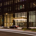
Mediating Mies: Dirk Lohan's Langham Hotel Lobby at the IBM Building - Image 1 of 4Mediating Mies: Dirk Lohan's Langham Hotel Lobby at the IBM Building - Image 2 of 4Mediating Mies: Dirk Lohan's Langham Hotel Lobby at the IBM Building - Image 3 of 4Mediating Mies: Dirk Lohan's Langham Hotel Lobby at the IBM Building - Image 4 of 4Mediating Mies: Dirk Lohan's Langham Hotel Lobby at the IBM Building - More Images+ 7

Living Under a Rock: Setenil de las Bodegas

The Andalucian town of Setenil de las Bodegas looks like something from the set of a culturally adventurous fantasy film, but cave dwelling is actually common in Andalucia; being so close to the African continental plate, geological forces threw up mountain ranges and volcanoes that are perfectly suited for habitation. The rocks and caves make for surprisingly easy settlement, and the nearby Cueva de la Pileta shows evidence of a human presence up to 25,000 years ago. After that, though, the inhabitants of the caves here are mostly ignored up until the 12th century, when Setenil's Moorish castle appears on the historical record.

Living Under a Rock: Setenil de las Bodegas - Image 1 of 4Living Under a Rock: Setenil de las Bodegas - Image 2 of 4Living Under a Rock: Setenil de las Bodegas - Image 3 of 4Living Under a Rock: Setenil de las Bodegas - Image 4 of 4Living Under a Rock: Setenil de las Bodegas - More Images+ 4

INTERIORS: Birdman

Interiors is an online film and architecture journal, published by Mehruss Jon Ahi and Armen Karaoghlanian. Interiors runs an exclusive column for ArchDaily that analyzes and diagrams films in terms of space. Their Official Store will carry exclusive prints from these posts.

There has been much said and written about the use of the long take in Alejandro González Iñárritu’s Birdman (2014), and how its filmmakers stitched together numerous long shots in an attempt to make the majority of the film feel like a continuous scene. The film follows (literally) its protagonist, Riggan Thomson (Michael Keaton), an actor past his prime, as he plans his career comeback with a stage production.

Emmanuel Lubezki seems the ideal collaborator for the director’s vision. The cinematographer, known for his extended takes in films such as Y Tu Mamá También (2001), Children of Men (2006) and Gravity (2013), has made use of the technique as a way of bringing audiences closer to the action. Birdman is the culmination of his experimentation with the form, bringing together these ideas and creating an immersive experience with a sense of urgency.

The film, of course, uses digital effects and editing as a way of creating its illusion. Birdman’s cuts are hidden between instances of darkness, made possible through the work of production designer Kevin Thompson, who started his work by mapping out the entire film on a floor plan of the sets.

A Wilderness in the City: How Diller Scofidio + Renfro's Zaryadye Park Could Help Fix Moscow

In late 2013, Diller Scofidio + Renfro won first prize in the international competition to design Zaryadye Park, Moscow's first new park in 50 years. The project is a headliner in a series of high-profile schemes that aim to improve the city's green space, including the renovation of Gorky Park and the recently revealed plans for the Moscow River. This article, originally published by The Calvert Journal as part of their How to Fix Moscow series examines how DS+R's urban "wilderness" will impact the city.

In a 2010 interview, the critic and historian Grigory Revzin complained that Muscovites wishing to "walk in parks and get pleasure from the city" would have to "come out into the streets" before anything was done. Hoping that architects would respond to the problem, one of Revzin's suggestions was a park to replace the site of Hotel Rossiya, which had become overgrown since being abandoned in 2007. This wild area in the city centre was, in fact, a harbinger of what is to come: Zaryadye Park, Moscow's first new park in 50 years, which the American design studio Diller Scofidio+Renfro won the international competition to design in November 2013.

A Wilderness in the City: How Diller Scofidio + Renfro's Zaryadye Park Could Help Fix Moscow  - Image 1 of 4A Wilderness in the City: How Diller Scofidio + Renfro's Zaryadye Park Could Help Fix Moscow  - Image 2 of 4A Wilderness in the City: How Diller Scofidio + Renfro's Zaryadye Park Could Help Fix Moscow  - Image 3 of 4A Wilderness in the City: How Diller Scofidio + Renfro's Zaryadye Park Could Help Fix Moscow  - Image 4 of 4A Wilderness in the City: How Diller Scofidio + Renfro's Zaryadye Park Could Help Fix Moscow  - More Images+ 4

The 14 Stories Behind the 2015 Building of the Year Award Winners

With our annual Building of the Year Awards, over 30,000 readers narrowed down over 3,000 projects, selecting just 14 as the best examples of architecture that ArchDaily has published in the past year. The results have been celebrated and widely shared, of course, usually in the form of images of each project. But what is often forgotten in this flurry of image sharing is that every one of these 14 projects has a backstory of significance which adds to our understanding of their architectural quality.

Some of these projects are intelligent responses to pressing social issues, others are twists on a well-established typology. Others still are simply supreme examples of architectural dexterity. In order that we don't forget the tremendous amount of effort that goes into creating each of these architectural masterpieces, continue reading after the break for the 14 stories that defined this year's Building of the Year Awards.

Through the Lens: When Hollywood Designs Prisons

The architecture of containment is a fascinating area. The spartan utilitarian spaces of prisons are among the most highly considered, sophisticated and expensive there are. It’s unusual for designers to create spaces for people who experience it against their will (well, mostly) and it is a tricky balance between creating sensitive, positive places for rehabilitation and community expectations about what punishment should look like. There are different approaches around the world: the US take a particular stance; the Norwegians have another. Hollywood, of course, has its own interpretation. And it is not concerned by such trivialities as the Geneva Convention.

In Conversation With Sheila O'Donnell And John Tuomey, 2015 Royal Gold Medallists

When Sheila O'Donnell and John Tuomey, who practice in partnership as O'Donnell + Tuomey, were named as this year's recipients of the RIBA Royal Gold Medal, a palpable collective satisfaction appeared to spread throughout the profession. No one could find criticism in Joseph Rykwert and Níall McLaughlin's nomination, nor the ultimate choice of the RIBA Honours Committee, to bestow the award upon the Irish team. Their astonishingly rigourous body of work, compiled and constructed over the last twenty five years, has an appeal which extends beyond Irish and British shores. A robust stock of cultural, community and educational projects, alongside family homes and social housing projects, leaves little doubt about the quality, depth and breadth of their mutual capabilities and the skill of those that they choose to collaborate with.

Read the conversation with the Gold Medallists after the break.

In Conversation With Sheila O'Donnell And John Tuomey, 2015 Royal Gold Medallists - Image 1 of 4In Conversation With Sheila O'Donnell And John Tuomey, 2015 Royal Gold Medallists - Image 2 of 4In Conversation With Sheila O'Donnell And John Tuomey, 2015 Royal Gold Medallists - Image 3 of 4In Conversation With Sheila O'Donnell And John Tuomey, 2015 Royal Gold Medallists - Image 4 of 4In Conversation With Sheila O'Donnell And John Tuomey, 2015 Royal Gold Medallists - More Images+ 16

Architecture Criticism By the People, For the People: The Films of Ila Bêka and Louise Lemoine

Selected as one of Metropolis Magazine's Game Changers for 2015, Ila Bêka and Louise Lemoine are altering the face of architectural criticism thanks to one simple premise: you don't need to be an expert to have an opinion on the buildings you live with every day. In the following profile, originally published by Metropolis as "Game Changers 2015: Ila Bêka and Louise Lemoine," Veronique Vienne uncovers what it takes to instil such a simple idea with both subtle poignancy and razor-sharp wit.

If walls could talk, what stories would they tell, not only about our intimate selves but also about our cultural assumptions, our social interactions, and the values we cherish most? Short of getting the inside story directly from walls, filmmakers Ila Bêka, 45, and Louise Lemoine, 33, strike up conversations with that other silent cast: the people who sweep the rooms, wash the windows, fix the leaks, and change the light bulbs.

“Our goal is to democratize the highbrow language of architectural criticism,” says Bêka, an architect and filmmaker trained in Italy and France. “Free speech on the topic of architecture is not the exclusive property of experts.”

Democratizing Design: Michael Graves' Legacy On Display in the "Past as Prologue" Exhibition

On show until April 5th at the Grounds for Sculpture in New Jersey, Michael Graves: Past as Prologue celebrates the fifty-year career of one of the United States' best-known and prolific architects. Graves is known for his unapologetic postmodernism which often divides opinion the profession. However in this review of the exhibition, originally published by Metropolis Magazine as "Shape Shifter," Samuel Medina finds that while it is easy to criticize in Graves' design style, it is hard to find fault with the noble intentions underlying his work.

“It’s been fifty years of more is more,” says Karen Nichols, a principal of Michael Graves & Associates, reiterating an aphorism Graves has taken a liking to in recent years. She is standing in front of an exhibition board in the retrospective, Michael Graves: Past as Prologue, which is currently on show at the Grounds for Sculpture in New Jersey. Nichols joined the firm in 1977, precisely the time when her employer made the fateful and rather lucrative pivot towards Postmodernism. The text on the exhibition wall behind her pinpoints The Big Break to the same year, depicting it with two like-minded projects. The first is the built Plocek House (1977), which originated the hide-the-keystone game Graves has been playing ever since. The other, the unrealized scheme for the Fargo-Moorhead Cultural Center Bridge (1977–1978), intended to enlighten the twin midwestern communities with a dose of the Enlightenment architect Claude Nicolas Ledoux’s architecture parlante.

To hear Nichols (and Graves) tell it now, it’s as if Graves were always more Venturian than Venturi, from his earliest neo-Corbusian villas, up through the pedimented temple he built for Disney in 1988. The truth is, Graves—the Cubist, the classicist, and the caricaturist—has always had a hard time saying “No.”

The Architecture of Product Design: Cross-Disciplinary Sketching Tools

A version of this article originally appeared on the Percolate Blog.

In spring of 2009, I graduated from architecture school. At the time, the post-recession economy was rough and not much was happening for architects. With an interest in entrepreneurship and technology, I took a risk and decided to try working at a tech startup. Much to my surprise, I fell in love with the industry and 5 years later, I’m now a Product Designer at Percolate in NYC, a company which produces web and mobile marketing software.

Since my career pivot, I’ve noticed many interesting parallels between architecture and product design. Although the mediums are different, it’s amazing to see how many of the design principles and processes are the same. To some degree, even the tools can be applied to both design industries. In this post, I will discuss hand-drawing, and learn how we apply architecture tools to product design at Percolate.

Architecture vs. PR: The Media Motivations of the Guggenheim Helsinki

More than ever, the media shapes architecture. The controversial Helsinki Guggenheim competition is as much about the use and exploitation of contemporary media as it is about design. The competition organisers are hugely proud to have over 1,700 entries to tweet about, but informed critics are less impressed. Has quantity ever guaranteed quality?

The competition has certainly created an impact. Some celebrate this, while others feel it has been detrimental to the profession, with so much unpaid time invested resulting in a low-level contribution to museum design.

Meanwhile, the spectre of Frank Gehry’s Bilbao Guggenheim, an “iconic” building that gave the American foundation so much positive publicity when it opened in 1997, haunts the Helsinki project. Finnish politicians hope for a similar success, a Sydney Opera postcard effect in this remote corner of the earth.

The Power Of The Plan: Drones And Architectural Photography

What is the draw of the aerial view? Whereas architects and designers often find solace in this particular spatial perspective there is a more inclusive, universal appeal to this way of seeing. The ease of access to online mapping services has increased our collective reliance on understanding our world from above.

Maps condense the planet into a little world inside our pocket, the commodification of which has universalised the ‘plan-view’ photograph. The question of whether or not their ubiquitous availability, having now been assimilated into our collective consciousness, is a positive step for the status of the plan is a discussion ongoing. Yet, in the face of this dilemma, architectural photographers are pushing the boundaries of drone technology in order to find new meaning.

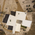
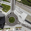
The Power Of The Plan: Drones And Architectural Photography - Image 1 of 4The Power Of The Plan: Drones And Architectural Photography - Image 2 of 4The Power Of The Plan: Drones And Architectural Photography - Image 3 of 4The Power Of The Plan: Drones And Architectural Photography - Image 4 of 4The Power Of The Plan: Drones And Architectural Photography - More Images+ 8

Michael Sorkin On The Guggenheim, Museum Culture, and "The Next Helsinki" Competition

Aside from attracting a huge level of media interest, the record-breaking competition to design the Guggenheim Museum's planned outpost in Helsinki also generated a significant level of criticism - not least from Michael Sorkin and his collaborators, who launched a counter-competition seeking alternative suggestions for how the site could be used. In this article, originally published on Metropolis Magazine as "'We Mean to Be Provocateurs': Michael Sorkin on the Next Helsinki Competition," Zachary Edelson interviews Sorkin on his reaction to the Guggenheim's shortlist, his hopes for his own competition, and the critical role that museums play in the worlds of both art and architecture.

The reverberations of the Bilbao Effect, where a prize museum infuses a region with prosperity and global cache, have concentrated on an unlikely city: the Finnish capital of Helsinki.

The Solomon R. Guggenheim Foundation is famous for its Fifth Avenue museum, but its 1997 Frank Gehry-designed Bilbao outpost famously catapulted its small Basque host city to new levels of international renown. The city’s tourism revenue quickly helped recoup the museum’s extensive costs: $100 million for design and construction, subsidies towards a $12 million annual budget, $50 million for an acquisitions fund, and $20 million to the Guggenheim for its name, curatorial services, and the use of parts of its collection. Within three years, visitors’ spending had garnered $110 million and by 2013 more than 1 million had entered the gleaming metallic structure. Many have tried to replicate Bilbao’s success but opposition against such massive expenditures always looms. In this case, it has manifested in a rival competition led by New York-based architect and writer Michael Sorkin and titled The Next Helsinki.

AR Issues: A Primer From the Prince

ArchDaily is continuing our partnership with The Architectural Review, bringing you short introductions to the themes of the magazine’s monthly editions. In this editorial from AR’s January 2015 issue, AR Editor Catherine Slessor reflects on The Prince of Wales’ ten principles for sustainable urban growth, which sparked widespread debate when they were published online near the end of December, arguing that the Prince's views are not just "some rose-tinted view of the past as the answer to the problems of modern life."

Some 25 years ago, the AR produced a special issue entitled "A Primer for the Prince". It recognised that in Britain, The Prince of Wales had come to exert a considerable influence on architecture, greatly increasing public awareness of the built environment and encouraging debate about the character of buildings and cities.

AR Issues: A Primer From the Prince - Image 4 of 4

Design Like You Give a Damn: The Legacy of Architecture for Humanity

In the introduction to Architecture for Humanity’s 2006 book Design Like You Give a Damn, founder Cameron Sinclair recounts a story from the early days of the organization. Half-joking yet deadly serious, he describes the day when, while still running Architecture for Humanity from a single cell phone around his day job at Gensler, he was contacted by the UN High Commissioner for Refugees who told him that Architecture for Humanity was on a list of organizations that might be able to help a potential refugee crisis in Afghanistan should the US retaliate in the wake of September 11.

“I hope it’s a long list,” says Sinclair. “No,” comes the answer.

“We’d like to think it was because we had already become a voice for humanitarian design - an unexpected touchstone in the movement for socially conscious architecture,” writes Sinclair of the incident. “The sad truth is that until 1999, when our fledgling organization got started along with a handful of others, there was no easily identifiable design resource for shelter after disaster.”

Now, after their sudden and rather unceremonious demise, Architecture for Humanity has left architecture a very different world from the one it entered almost sixteen years ago.

Dear Martha: An Open Letter to the Pritzker Prize Committee

As the Pritzker Jury begins its deliberations for the 2015 Pritzker Prize, this is a critical time of year for shaping the landscape of architectural debate for the coming year and beyond. The following is an open letter to Martha Thorne, the Executive Director of the Pritzker Prize, from Conrad Newel, author of the popular blog Notes on Becoming a Famous Architect.

Dear Martha,

I have to hand it to you and all the people on the Pritzker committee, you guys are a very crafty bunch. Just when I thought I had you all figured out, you have now - even though only slightly - succeeded in confounding me.

From my 2011 analysis of the Pritzker, I figured that your potential pool of laureates was always a very predictable bunch. In fact anyone could look at my data and predict with reasonable certainty that the next laureate would most likely be an Asian or Caucasian male starchitect from Europe, The USA, or Japan. I further pointed out that none of your laureates have done much in the way of humanitarianism, despite the fact that the mission statement of the Pritzker also asks that the recipient should be making significant contributions to humanity. I maintained that this part of the mandate has been consistently overlooked.

Code of Context: The Uneasy Excitement of Global Practice

Code of Context: The Uneasy Excitement of Global Practice - Image 17 of 4

Global, the Winter 2014 issue of ArchitectureBoston magazine, out now, is an examination of the challenges and opportunities facing architects working abroad, from the Middle East to Africa to Asia. The topics explored in this issue include how to value resource-constrained approaches, honor local vernacular, and learn from the urbanization precedents set in other parts of the world. In this article, Jay Wickersham FAIA examines how in a globalized market, architecture firms can take steps to ensure that their designs act in the best interests of the foreign communities they affect.

The signs of architecture’s globalization are all around us. Foreign students flock to Boston to study architecture, prominent buildings are designed by foreign architects, American firms build practices around international projects. Globalization has allowed architects to work outside their own regions and cultures, at a scale and with a freedom of design they might never enjoy at home. But beneath the excitement and glamour of international practice, I sense an unease. Are we creating vital and original new architectures, or are we homogenizing cities and landscapes and obliterating regional differences? Are architects helping to strengthen and develop the economies of host communities, or are they acting as unwitting tools of inequality and repression?

Code of Context: The Uneasy Excitement of Global Practice - Image 1 of 4Code of Context: The Uneasy Excitement of Global Practice - Image 2 of 4Code of Context: The Uneasy Excitement of Global Practice - Image 3 of 4Code of Context: The Uneasy Excitement of Global Practice - Image 4 of 4Code of Context: The Uneasy Excitement of Global Practice - More Images+ 13

Inequality and Informality in New York: SITU Studio's Proposal for MoMA's Uneven Growth Exhibition

When it comes to discussing informal housing, it's usually cities in developing nations that take the spotlight - however, as revealed by SITU Studio's contribution to MoMA's Uneven Growth exhibition, issues of informal housing are indeed present in cities across the spectrum of development. In this interview, originally posted on Arup Connect as "Inequality and informality in New York," Sarah Wesseler speaks to SITU Studio principle Bradley Samuels about their unconventional proposal to address an issue that is frequently overlooked in New York city policy.

Uneven Growth: Tactical Urbanisms for Expanding Megacities, a newly opened exhibit at New York’s Museum of Modern Art, focuses on the complex relationship between urbanization and inequality. Over the 14-month period leading up to the launch, six interdisciplinary teams explored how these issues are playing out in different parts of the world, each developing an architectural response for a specific city.

Architecture firm SITU Studio (together with Cohabitation Strategies [CohStra]) was tasked with studying its home city, New York. (Arup transport planner Michael Amabile also consulted with the team.) We spoke with SITU principal Bradley Samuels about the project.

Inequality and Informality in New York: SITU Studio's Proposal for MoMA's Uneven Growth Exhibition - Image 1 of 4Inequality and Informality in New York: SITU Studio's Proposal for MoMA's Uneven Growth Exhibition - Image 2 of 4Inequality and Informality in New York: SITU Studio's Proposal for MoMA's Uneven Growth Exhibition - Image 3 of 4Inequality and Informality in New York: SITU Studio's Proposal for MoMA's Uneven Growth Exhibition - Image 4 of 4Inequality and Informality in New York: SITU Studio's Proposal for MoMA's Uneven Growth Exhibition - More Images+ 5

The Architecture of Product Design: Circulation in Mobile Apps

The Architecture of Product Design: Circulation in Mobile Apps - Featured Image
Courtesy of Percolate

A version of this article originally appeared on the Percolate Blog.

In spring of 2009, I graduated from architecture school. At the time, the post-recession economy was rough and not much was happening for architects. With an interest in entrepreneurship and technology, I took a risk and decided to try working at a tech startup. Much to my surprise, I fell in love with the industry and 5 years later, I’m now a Product Designer at Percolate in NYC, a company which produces web and mobile marketing software.

Since my career pivot, I’ve noticed many interesting parallels between architecture and product design. Although the mediums are different, it’s amazing to see how many of the design principles and processes are the same. To some degree, even the tools can be applied to both design industries. In this post, I will discuss how circulation is a fundamental property in the usefulness of both buildings and products.

One of the greatest lessons I learned in architecture school is the importance of circulation systems in the design of buildings.

6 Modern Pyramids that Show Timeless Geometry is Here to Stay

If you were a Greek tourist in the 1st century BCE you would likely have had something in your hand that would be quite familiar here in the 21st century. A guide book. The most popular guide book of the Hellenic world listed seven wonders of the world that should be visited by any Greek traveler.

Of those seven wonders, six no longer exist. The Colossus of Rhodes, the Lighthouse of Alexandria, and the Mausoleum at Halicarnassus were lost to natural causes, the Temple of Artemis and Statue of Zues destroyed by human hands, and no one knows what happened to the Hanging Gardens. The remaining wonder is the Great Pyramid of Giza. This colossal Egyptian structure is so grand a work that even today, 4,500 years after its construction, it is still considered by some to be the most impressive civil engineering project in history, beating out feats like the Panama Canal, the Hoover Dam, and the Golden Gate Bridge.

The pyramid isn’t just an ancient wonder. Just as the Great Pyramid has managed to survive into modern times, so has our love affair with the simple but powerful angled shape. Modern architects and engineers continue to build pyramids. These modern pyramids may not be stone tombs to ancient pharaohs, but are no less stunning for all that. Read on after the break for six examples.

6 Modern Pyramids that Show Timeless Geometry is Here to Stay - Image 1 of 46 Modern Pyramids that Show Timeless Geometry is Here to Stay - Image 2 of 46 Modern Pyramids that Show Timeless Geometry is Here to Stay - Image 3 of 46 Modern Pyramids that Show Timeless Geometry is Here to Stay - Image 4 of 46 Modern Pyramids that Show Timeless Geometry is Here to Stay - More Images+ 11

Light Matters: UN Celebrates The International Year of Light 2015

Light is all around us, and it increasingly affects our daily lives. For example, we have started to carry personal light sources around with our smartphones, and in our homes many electrical machines now utilize light to display information and simply to appear more attractive. In a larger context, architecture and cities have also developed a new dimension with the advent of electrical lighting for work and entertainment.

Inspired by the central role of light for our culture and technology, the United Nations has proclaimed 2015 as the “International Year of Light and Light-based Technologies” (IYL2015). With IYL2015 the UN wants to raise the awareness of the importance of light and optical technologies in our lives, our future and the development of society.

Read on after the break for more enlightenment around IYL2015.

Light Matters: UN Celebrates The International Year of Light 2015 - Image 1 of 4Light Matters: UN Celebrates The International Year of Light 2015 - Image 2 of 4Light Matters: UN Celebrates The International Year of Light 2015 - Image 3 of 4Light Matters: UN Celebrates The International Year of Light 2015 - Image 4 of 4Light Matters: UN Celebrates The International Year of Light 2015 - More Images+ 7

You've started following your first account!

Did you know?

You'll now receive updates based on what you follow! Personalize your stream and start following your favorite authors, offices and users.