1. ArchDaily
  2. Articles

Articles

Shan-Zhen: How a Small Irish Town Influenced the Mega-City Shenzhen

At the dawn of the age of transatlantic commercial aviation, Shannon, a small town on the west coast of Ireland, was thrust into the spotlight. By 1959 it had been developed as the world’s first Free Trade Zone and New Town, providing a new—and persistent—business model for US multinationals seeking cheaper ways to operate in Europe. On the other side of the world, China was beginning to develop its urbanisation policy and was interested in how Shannon had successfully decentralised its administration from Dublin. After many visits in the early 1980s by Chinese leaders to study this model, under the direction of Deng Xiaoping, the Shannon planning system was used as a template in the formation of Shenzhen and has since been rolled across China.

New Horizon_architecture from Ireland is the flagship exhibition programme for Irish architecture and the built environment as part of Irish Design 2015. Shan-Zhen was first presented at the Bi-City Biennale of Urbanism\Architecture in 2015.

It’s Elementary (Not): On the Architecture of Alejandro Aravena

It’s Elementary (Not): On the Architecture of Alejandro Aravena - Featured Image
Siamese Towers. Image © Cristobal Palma

When reading about the work of Alejandro Aravena, it can sometimes seem like two distinct discussions: one about his widely praised social housing innovations, and another about his impressive (albeit more conventional in scope) buildings for universities and municipalities. In this post originally shared on his Facebook page Hashim Sarkis, the Dean of the MIT School of Architecture and Planning, connects the two apparently separate threads of Aravena's architecture, discovering the underlying beliefs that guide this year's Pritzker Prize winner.

Much of the work of Alejandro Aravena, whether designed alone or with the group ELEMENTAL, embodies a eureka moment, a moment where after a careful interrogation of the program with the client, the architect comes up with a counterintuitive but simple response to the charge. (For the computer center at the Catholic University, the labs have to be both dark and well-lit. For the social housing in Iquique, instead of a full good house that you cannot afford, you get a half good house that you can). In turn, these simple equations are embodied in buildings that usually acquire similarly simple forms. The clients and occupants repeat the “aha” with Aravena’s same tone and realization. “If I cannot convincingly convey the design idea over the phone, then I know it is a bad idea,” he says.

It’s Elementary (Not): On the Architecture of Alejandro Aravena - Image 1 of 4It’s Elementary (Not): On the Architecture of Alejandro Aravena - Image 2 of 4It’s Elementary (Not): On the Architecture of Alejandro Aravena - Image 3 of 4It’s Elementary (Not): On the Architecture of Alejandro Aravena - Image 4 of 4It’s Elementary (Not): On the Architecture of Alejandro Aravena - More Images+ 6

Immerse Yourself in 3D Models Online With Sketchfab's New Virtual Reality Feature

Sketchfab, the browser-based platform for sharing and viewing 3D models, has announced a new feature on their software that turns any of their models into a virtual reality experience when viewed on a smartphone and combined with a simple headset like Google Cardboard. Sketchfab allows users to upload a wide variety of 3D model file types that could then be shared and viewed in any web browser, or embedded on websites or social media, without the need for any additional software or plug-ins. As a result, over the past few years they've built up a huge database of over half a million 3D models, and this new VR feature allows viewers to experience those models in a whole new way.

AD Readers Debate: Alejandro Aravena's Pritzker Prize and More

The announcement of the Pritzker Prize is often the biggest news story of the year in architecture. This year it seems will be no different: the accolade went to Alejandro Aravena, with the jury paying particular attention to his social housing work, and with the Aravena-directed Venice Biennale right around the corner, it seems that this year we'll be talking a lot about the 48-year-old Chilean.

That discussion has already begun in our comments section, where readers debated the pros and cons of the decision by the Pritzker Jury. Read on to find out what our readers had to say about Aravena and the other big stories of recent weeks.

How Driverless Cars Could, Should - and Shouldn't - Reshape Our Cities

In the race to bring driverless cars from a futuristic fantasy to a present-day reality, developers have touted a plethora of advantages, from reduced traffic congestion on roads to improved safety thanks to the elimination of human error. But the potential widespread implementation of driverless cars could also have profound impacts on the form of our urban environments, fundamentally reshaping infrastructure and land use. As recently as a year ago, this new technology was seen as decades away; however, recently Elon Musk, CEO of electric car maker Tesla, predicted that driverless cars will be capable of making cross-country treks within about two years, and a pilot program in the United Kingdom city of Milton Keynes plans to launch a fleet of driverless pod-taxis by 2018, matching Musk’s timeline.

The driverless car future could be just around the corner, and the normally slow-changing infrastructure of cities could be forced to apply quick fixes to adapt. At the same time, the full potential of driverless cars cannot be realized without implementing significant changes to the urban fabric. So how will driverless cars change how our cities work, and how will our cities adapt to accommodate them?

Frozen Architecture: From Glistening Snow Shows to Multi-Colored Ice Festivals

Winter is the perfect time to build structures with ice, a time and a technique that together offer the possibility of a pure white architecture. With a cloudy sky the condition culminates into an impressive whiteout: white architecture, the landscape and the sky dissolve into a diffuse unity without a visible horizon. If clear skies emerge a subtle contrast of warm and cool white appears with yellowish sunrays against the blue sky. However, the ice itself has striking effects as well: The surface appearance ranges from crystal clear glass to soft opaque impressions. And, for the long nights, illumination achieves an additional magical glow and extends the short daylight time.

Worldwide, snow shows, ice hotels and festivals have attracted numerous visitors with glistening snows and stunning lighting solutions. Futhermore, this frozen water strategy presents a sustainable solution par excellence, where the manufacturing and even disposal causes no harm to the environment. Read on to explore the coolest projects and events featuring architects and artists from Finland to China.

Frozen Architecture: From Glistening Snow Shows to Multi-Colored Ice Festivals - Image 1 of 4Frozen Architecture: From Glistening Snow Shows to Multi-Colored Ice Festivals - Image 2 of 4Frozen Architecture: From Glistening Snow Shows to Multi-Colored Ice Festivals - Image 3 of 4Frozen Architecture: From Glistening Snow Shows to Multi-Colored Ice Festivals - Image 4 of 4Frozen Architecture: From Glistening Snow Shows to Multi-Colored Ice Festivals - More Images+ 2

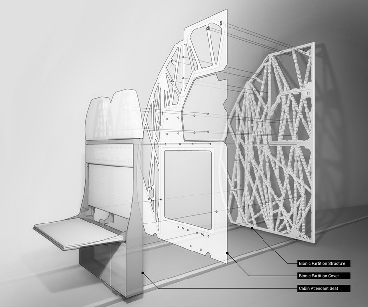
The Living's 3D Printed Airplane Partition is Designed to Mimic Bone Structure

You’ve probably never given much thought to the seemingly basic interior partitions of an airplane, but building codes are a walk in the park compared to the exacting standards of aviation design. Those thin panels that separate the seats from the plane's galley must also be capable of supporting the weight of flight attendant jumpseats and providing a removable section to accommodate emergency stretchers - not to mention the rigorous safety standards and crash testing that aviation components must satisfy. With all of these challenges in mind, The Living, an Autodesk Studio, in collaboration with Airbus and APWorks, have developed the Bionic Partition Project, which harnesses generative design and 3D printing to maximize the structural efficiency of the panel, reducing the weight of an aircraft, and saving fuel. And while this particular application is specific to a single aircraft type, the technological advances could have far-reaching implications.

The Living's 3D Printed Airplane Partition is Designed to Mimic Bone Structure - Image 1 of 4The Living's 3D Printed Airplane Partition is Designed to Mimic Bone Structure - Image 2 of 4The Living's 3D Printed Airplane Partition is Designed to Mimic Bone Structure - Image 3 of 4The Living's 3D Printed Airplane Partition is Designed to Mimic Bone Structure - Image 4 of 4The Living's 3D Printed Airplane Partition is Designed to Mimic Bone Structure - More Images+ 6

A Virtual Look Into Richard Neutra's Unbuilt Case Study House #6, The Omega House

This 3D model is as close as you can get to the real thing, as Omega House is one of the few Case Study Houses that was never built. Presented early in the case study program of Arts & Architecture magazine in 1945, it presents one of the most innovative design concepts in the series, one you can now explore in your browser.

The architect, Richard Neutra, was a celebrity in his own lifetime, and among the most esteemed of the high modernists. Neutra was born in Vienna and already over 30 when he arrived in America in 1923. He worked for Erich Mendelsohn, for Frank Lloyd Wright, and briefly with Rudolph Schindler. Many of his commissions were domestic houses, structures that he managed to make wonderfully photogenic. Neutra carried himself with some of the aristocratic manner of a Mies van der Rohe, but tempered by the lively west coast egalitarianism of Charles and Ray Eames (link to previous project). He made the cover of Time Magazine in the forties, and might be one of the only prominent architects ever to build a drive-in church. Perhaps most remarkably, Ayn Rand wrote the screenplay to The Fountainhead whilst living in a house designed by Neutra.

How I Developed Ergo Kiwi, an Ergonomic Craft Knife that Your Fingers Will Thank You For

If you've been through architecture school you're probably wary of craft knives, which can puncture the skin of an non-alert, caffeinated student at a fraction of a second's notice. Even if you manage to avoid the hospital, though, these scourges of the studio still know how to hurt you: their designs are the antithesis of ergonomics, making a marathon modeling session a mighty endurance battle against hand cramps and joint pain. Aiming for a more comfortable solution, architecture graduate Sean Riley developed the Ergo Kiwi, and today is launching a Kickstarter campaign to help bring the product to market.

In addition, Riley has also meticulously cataloged his design and production process. At ArchDaily, we thought it gave a fascinating insight into not only the design of Ergo Kiwi, the but the steps involved in developing and bringing to market a convincing product. As a result, we invited him to share his story.

How I Developed Ergo Kiwi, an Ergonomic Craft Knife that Your Fingers Will Thank You For - Image 1 of 4How I Developed Ergo Kiwi, an Ergonomic Craft Knife that Your Fingers Will Thank You For - Image 2 of 4How I Developed Ergo Kiwi, an Ergonomic Craft Knife that Your Fingers Will Thank You For - Image 3 of 4How I Developed Ergo Kiwi, an Ergonomic Craft Knife that Your Fingers Will Thank You For - Image 4 of 4How I Developed Ergo Kiwi, an Ergonomic Craft Knife that Your Fingers Will Thank You For - More Images+ 22

OMA/AMO's Latest Prada Runway is Inspired by 17th Century Auto-Da-Fé Trials

When it comes to the modern-day fashion show, the internet has fundamentally changed the way audiences interact with models and designers, say OMA/AMO, arguing: "The assemblage of recorded impressions and digital reactions inserts itself into the once autonomous narrative of the fashion show. The statement of the collective spreads. The mass of fragmented instant data is uploaded and critiqued by a multitude of voices."

With their latest fashion show design for Prada, which was used to showcase the designer's upcoming fall/winter menswear collection in Milan yesterday, the firm sought to enhance this sense of public judgement. "This consumption of images is like a public trial, a contemporary transposition of the Auto-da-fé," explains their press release, referring to the ceremonies of public penance which took place in the Portuguese and Spanish Inquisitions in the 15th-17th centuries.

OMA/AMO's Latest Prada Runway is Inspired by 17th Century Auto-Da-Fé Trials - Image 1 of 4OMA/AMO's Latest Prada Runway is Inspired by 17th Century Auto-Da-Fé Trials - Image 2 of 4OMA/AMO's Latest Prada Runway is Inspired by 17th Century Auto-Da-Fé Trials - Featured ImageOMA/AMO's Latest Prada Runway is Inspired by 17th Century Auto-Da-Fé Trials - Image 3 of 4OMA/AMO's Latest Prada Runway is Inspired by 17th Century Auto-Da-Fé Trials - More Images+ 2

Three Years in Villa Verde, ELEMENTAL’s Incremental Housing Project in Constitución, Chile

Where were you when it happened? On February 27, 2010 an 8.8-magnitude earthquake and subsequent tsunami struck Chile, causing destruction across the country. Ask any Chilean what they were doing at the time, and they will have a story to tell.

Oriana Pinochet Villagra and her family were in Constitución when the ground started to shake. A town centered around the forestry industry, Constitución is surrounded by green mountains, and situated where the Maule river meets the Pacific Ocean.

It was one of the cities most affected by the earthquake in 2010. The ocean water flooded the river, wrecking everything that the earthquake hadn’t already destroyed. Those that lived along the riverbank were left in the street with mud burying their houses -- Oriana's family lost 30 years of memories.

Almost six years after the natural disaster, we visited Constitución where Oriana Pinochet showed us one of the major reconstruction projects in the city: Villa Verde Housing, a residential neighborhood for 484 of the affected families. With partial financing from housing subsidies and based on the idea of incremental housing, the project is designed by ELEMENTAL, the “Do Tank” of 2016 Pritzker Prize laureate, Alejandro Aravena.

Video: The "Polis Station," Studio Gang's Ideal for a Post-Ferguson America

At this year’s Chicago Architecture Biennial the directors Joseph Grima and Sarah Herda asked participating architects to demonstrate the “State of the Art of Architecture" by submitting projects that they felt told a story about architecture’s importance in society. As explained in this video by Politico Magazine, native Chicagoan Jeanne Gang of Studio Gang Architects responded to this call by looking at an issue that has plagued American cities in startling ways in recent years: the troubled relationships between communities and their police forces. Often hidden behind fortress-like buildings, police stations in their current form tend to project an image closer to hostile than welcoming. But Gang believes it doesn’t have to be that way.

The Avant-Garde of Adaptive Reuse: How Design For Deconstruction is Reinventing Recycling

As an idea that was developed fairly early on in the movement for sustainability, and picked up significant traction a few years into the new millennium, "Design for Deconstruction" has been around for some years. Yet still, considered on the scale of building lifespans, the idea is still in its infancy, with few opportunities to test its principles. In this post originally published on Autodesk's Redshift publication as "Recycled Buildings or Bridges? Designing for Deconstruction Beyond Adaptive Reuse," Timothy A Schuler looks at the advances that have been made, and the challenges that still face, the design for deconstruction movement.

This summer, the Oakland Museum of California announced a new public arts grant program. Except instead of money, selected artists would receive steel. Tons of it.

The Bay Bridge Steel Program emerged out of a desire to salvage and repurpose the metal that once made up the eastern span of San Francisco’s Bay Bridge, originally constructed in 1933 (it was replaced in 2013). The steel in question, sourced from “spans referred to as ‘504s’ and ‘288s’ (in reference to their length in feet),” according to the application material, would be available for civic and public art projects within the state of California.

The program represents a unique opportunity to adaptively reuse infrastructure, upcycling what might have been waste. And yet any instance of adaptive reuse is inherently reactive because the design process is dictated by an existing condition.

The Avant-Garde of Adaptive Reuse: How Design For Deconstruction is Reinventing Recycling - Image 1 of 4The Avant-Garde of Adaptive Reuse: How Design For Deconstruction is Reinventing Recycling - Image 2 of 4The Avant-Garde of Adaptive Reuse: How Design For Deconstruction is Reinventing Recycling - Image 3 of 4The Avant-Garde of Adaptive Reuse: How Design For Deconstruction is Reinventing Recycling - Image 4 of 4The Avant-Garde of Adaptive Reuse: How Design For Deconstruction is Reinventing Recycling - More Images+ 4

This Video Reimagines Paris as a City that is All Facade

Museums, restaurants, shops, theaters. These are the types of spaces the public interact with on a regular basis in a city. But these spaces alone do not make a city - in fact, the vast majority of buildings house spaces that 99 percent of the population will never see. Yet a true city experience cannot exist without these buildings. What is the true value of private buildings to the tourist or the passer-by on the street? Is it simply a matter of aesthetic and identity? Could the same result be achieved with a streetwall made up of only facades? These are the implicit questions embedded in “Apparences,” the new video from Claire and Max of Menilmonde. The duo uses video editing and CGI to alter iconic Paris views, making the city of romance appear to be little more than the world’s largest movie set.

A city with the history and imagery of Paris cannot be mistaken for a Potemkin Village - the city functions still as one of the preeminent economic centers in the world. Yet its status as one of the world’s most visited cities and tales of its beauty and luxury often plant false visions of grandeur in visitors’ minds.

These Are the Best Architecture Images from the NYPL’s New Public Domain Collection

Last week the New York Public Library made over 180,000 images from their digital archives available in the public domain, and free for high-resolution download. Not only are the images available for download, but since they are in the public domain and free of any copyright restrictions, users have the freedom to get creative and alter, modify, and reuse the images in any manner they see fit. Featuring a wide variety of images including drawings, engravings, photographs, maps, postcards, and in some cases, digitized copies of entire books, the collection has been noted for fascinating historical artifacts such as a set of color drawings of Egyptian gods and goddesses, and a digitized book from the 18th century containing over 400 color plates depicting various current and historical fashion trends.

Of course, the archive also includes a significant assortment of captivating architectural images that range from everyday scenes to historic treasures. We've trawled the database to find some of the most unusual and insightful examples - read on to see a selection of the most interesting architectural images from NYPL’s digital archives.

These Are the Best Architecture Images from the NYPL’s New Public Domain Collection - Image 5 of 4These Are the Best Architecture Images from the NYPL’s New Public Domain Collection - Image 20 of 4These Are the Best Architecture Images from the NYPL’s New Public Domain Collection - Image 24 of 4These Are the Best Architecture Images from the NYPL’s New Public Domain Collection - Image 30 of 4These Are the Best Architecture Images from the NYPL’s New Public Domain Collection - More Images+ 31

Leonardo DiCaprio, Eco-Tourism, and Blackadore Caye: Has Green Building Jumped the Shark?

In early April 2015, the New York Times reported on Leonardo DiCaprio’s recent purchase of Blackadore Caye, a small island off the coast of Belize that has faced significant environmental degradation and erosion. A patron of several environmental projects, DiCaprio is partnering with Paul Scialla, CEO of the Delos real estate and wellness platform, to create an eco-resort intended to serve as the latest model of cutting-edge, environmentally-responsible tourism development. The development plans include a row of floating guest suites built over the water, 48 private villas (ringing in at $5-15 million), human health and anti-aging wellness programs, and a conservation area. The project is advertised as meeting the ambitious green building standards of the Living Building Challenge and the WELL Building Standard®.

Many Times readers in the comments section sardonically noted that the private jets and the shipment of building materials and daily resources for island development come with large environmental and social price tags that far outweigh the conservation efforts associated with the resort. On the other hand, a few commentators pointed out that the development will employ local labor and save the island from complete degradation. The discussion surrounding the pros and cons of “eco-tourism” development is not a new one, and not one that is easily settled.

But beyond the (important) discussion of the impacts of eco-tourism, the development raises questions about the emergence of alternative green building market standards, which ostensibly aim to transform the building industry by setting measurable targets for the environmental and social effects of the places we live and work.

How Danish Architects Connect with Users to Provide Them With the Best Architecture Possible

The Architecture Project recently invited us to visit the city of Aarhus, Denmark as part of a press tour related to health and architecture, with the aim of seeing the latest healing projects that are arising in the city.

Overshadowed for years by Copenhagen, Aarhus is a port city that seeks to reinvent itself and shine once again – and it is succeeding. The pleasant surprise is that it is the architects who have driven this change. Architecture has invaded all of the city's spaces, from the forgotten industrial port to the downtown areas full of historical buildings.

This visit has taught us some important lessons: 'healing architecture' isn't only about hospital projects, but rather about encouraging people, about creating friendly spaces to live and coexist, and about getting as connected as possible with users to give them what they really need. 

Check out some of the strategies used to achieve these goals after the break. 

The Architectural Review Announces Winners of the 2015 AR Emerging Architecture Awards

The Architectural Review have selected the winners of the 2015 AR Emerging Architecture Awards, billed as “the world's most popular and prestigious prize for up-and-coming architects, giving emerging practices invaluable impetus on their trajectory to wider recognition and success.” Previous award winners include Sou Fujimoto, Thomas Heatherwick, Sean Godsell, Jurgen Mayer H. and Li Xiaodong.

The award is given to completed projects, with entries consisting of buildings, interiors, landscaping, refurbishment, urban projects, temporary installations, furniture and product design. For its 17th year, the jury was comprised of architects Odile Decq, David Adjaye and Sir Peter Cook, and together they searched for what they referred to as the most “resistant” design.

Read on to see this year’s Emerging Architecture Award winners and a video with the jury on the selection process.

The Architectural Review Announces Winners of the 2015 AR Emerging Architecture Awards - Image 1 of 4The Architectural Review Announces Winners of the 2015 AR Emerging Architecture Awards - Image 2 of 4The Architectural Review Announces Winners of the 2015 AR Emerging Architecture Awards - Image 3 of 4The Architectural Review Announces Winners of the 2015 AR Emerging Architecture Awards - Image 4 of 4The Architectural Review Announces Winners of the 2015 AR Emerging Architecture Awards - More Images+ 17

This Conceptual Design Reinvents Power Plants as Mixed-Use Megastructures

What if a power plant could also be a home, an office, or even a park? That is the question behind Cypher CO2ling Plant, a conceptual design developed by Kawan Golmohamadi, Shilan Golmohamadi, and Soad Moarefi. Power plants are a ubiquitous and inevitable byproduct of modern lifestyles, but they are typically located in remote areas, far from where the power is actually needed, due to their unsightly appearance and the emissions associated with combustion-fueled energy generation. Cypher CO2ling Plant proposes an alternative scenario that utilizes the infrastructure of the power plant’s cooling towers to support mixed-use development, while also mitigating the less desirable aspects of energy generation.

This Conceptual Design Reinvents Power Plants as Mixed-Use Megastructures - SustainabilityThis Conceptual Design Reinvents Power Plants as Mixed-Use Megastructures - SustainabilityThis Conceptual Design Reinvents Power Plants as Mixed-Use Megastructures - SustainabilityThis Conceptual Design Reinvents Power Plants as Mixed-Use Megastructures - SustainabilityThis Conceptual Design Reinvents Power Plants as Mixed-Use Megastructures - More Images+ 7

Take a Look Inside OMA's Timmerhuis with #donotsettle

In the latest video from the youtube channel #donotsettle, architects Wahyu Pratomo and Kris Provoost explore OMA’s recently opened Timmerhuis in Rotterdam. The duo compare the conceptual design and renderings to the finished building, look at the impact the new building is having on the cityscape, and with some good fortune find their way through some locked doors.

#Donotsettle was started to reconcile the disparity between film as architectural representation and as an experiential medium. For more #donotsettle, check out their youtube page, where they walk through the Markthal, designed by Rotterdam-based practice MVRDV and the train station in Delft, designed by Delft-based practice Mecanoo, among many other sites.

For Terreform ONE, Bioengineering is the Future of Design

Could an emergency shelter also provide its users with food? Could we make furniture you can eat? Could you merge furniture and farming into one device?

It’s questions like these that set biodesign studio Terreform ONE (Open Network Ecology) apart from other design collaboratives. Instead of looking at design as finding a solution to solve one problem, their structures and furniture pieces try to tackle many issues facing the planet all at once. Need a structure to house refugees as well as find them a reliable source for protein? Why not build them a home that also acts as a cricket farm?

AR Issues: How Cultural Buildings Can Help Prevent Gentrification, Not Cause It

ArchDaily is continuing our partnership with The Architectural Review, bringing you short introductions to the themes of the magazine’s monthly editions. In this introduction to the January 2016 issue, Editor Christine Murray recounts what we know about gentrification, and how cultural buildings can be planned to encourage - rather than destroy - a neighborhood's cultural vibrancy.

Cultural buildings are the new town halls: more socially inclusive than the pub or the church.

The best cultural projects act as public spaces, schools for continuing education, crucibles for talent, fostering innovation and social happenings, from yoga classes to children’s libraries. When free of entry charge, they are a place you can go to learn, rather than just buy – a triumph of experience over consumerism.

But what we’ve learned from the failure of the icon-building boom is that, for a cultural building to really contribute to a city, it must be part of a social ecosystem, not simply a place for tourists to visit. A cultural hub must be connected into a pre-existing cultural vibrancy, supported by decent infrastructure and a community that actually lives there.

ArchDaily Readers Tell Us Who Should Win the 2016 Pritzker Prize

For over 30 years, the Pritzker Prize has awarded some of the most inspirational and accomplished architects on the planet, and it has long helped to shape public discussion about current trends and ideas in architecture. Recent years have been no exception; in 2014, for example, the jury's citation of Shigeru Ban's humanitarian work sparked a heated discussion about the social duties of architects.

However, just as the selection by the Pritzker jury can shape public debate, it is also influenced by public opinion. So with the announcement of the 2016 Pritzker Prize winner due on Wednesday, last month we asked our readers to give us an insight into which architects they feel should be in the running. Through a poll and the comments on the post, they let us know who they think is deserving of architecture's biggest prize.

In Praise of the Glitch: WAA's Yinchuan Contemporary Art Museum

In November, the Architectural Review concluded its search for this year's most promising young designers, awarding a total of 15 projects in its annual Emerging Architecture Awards. Selected by a jury comprising David Adjaye, Peter Cook and Odile Decq alongside AR Editor Christine Murray, these 15 projects included just one firm from China: WAA (We Architect Anonymous), whose Yinchuan Museum of Contemporary Art (MOCA) was commended by the judges. In this article, former associate member of Archigram Colin Fournier reviews the awarded building, showing an appreciation of WAA's work equal to - or perhaps even greater than - the award's jury.

This contemporary art museum is not what it seems. It appears, at first, to be a fairly familiar manifestation of the contemporary architectural discourse, and indeed the striking fluidity of its lines and its impressive mastery of parametrically-enabled tectonics as well as GRC technology put it on a par with recent buildings by Zaha Hadid or MAD, but this first impression is somewhat deceptive: the building is, in fact, refreshingly unique and a radical point of departure from the dominant design ideology of our times, a significant rupture from the orthodoxy. And a very promising one.

In Praise of the Glitch: WAA's Yinchuan Contemporary Art Museum - Image 1 of 4In Praise of the Glitch: WAA's Yinchuan Contemporary Art Museum - Image 2 of 4In Praise of the Glitch: WAA's Yinchuan Contemporary Art Museum - Image 3 of 4In Praise of the Glitch: WAA's Yinchuan Contemporary Art Museum - Image 4 of 4In Praise of the Glitch: WAA's Yinchuan Contemporary Art Museum - More Images+ 7

You've started following your first account!

Did you know?

You'll now receive updates based on what you follow! Personalize your stream and start following your favorite authors, offices and users.