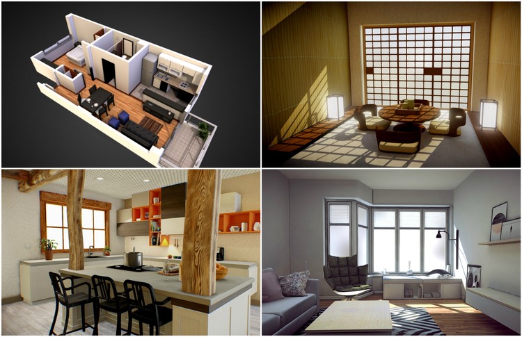
When making a 3D model, just as with a physical model, one of the biggest challenges is in effectively conveying the feeling of a design's interior. This is made worse by the fact that historically, 3D modeling and viewing software has treated the design being modeled as primarily an object to be orbited around, rather than as a space to be viewed from within. The introduction of first-person viewing modes has improved this, but these still are hampered by the fact that movement is never as simple or intuitive as simply walking around in real space. All of this can make presenting interior spaces a frustrating experience.
However, there are a variety of techniques you can use to display interiors more effectively. In the second of our Selected by Sketchfab series, our partners at Sketchfab have picked out the best examples of from their platform of models that inventively show off interior spaces.
Option 1: The Cutaway Plan
The first way - and the technique that might seem most intuitive to architects - is to cut away the ceiling and the tops of the walls of the design to present something that is half way between a completed model and a plan. The upside of this technique is that it's a simple way to present an entire floorplan, rather than just a single space:
The cutaway plan can also be used to highlight certain aspects of the design. In the following model, the height of the cut varies depending on the space the cut wall encloses:
Using this method, the designer is able to highlight the spaciousness of the living space as opposed to the more tightly packed bathroom or the kitchen units which occupy the back wall. However, this also neatly demonstrates the key drawback of this technique: it's not really suited for viewing in first person, as the user peers over the "tops" of walls into adjacent spaces they shouldn't really be able to see.
Option 2: Remove Walls and Ceilings
One option which is better suited to first-person viewing is simply to remove selected walls and ceilings from a model to give users select views into a model from outside. This is ideal for giving a view into tight spaces, and can still be used to show multiple adjacent spaces (providing the designer is smart about which walls they remove) as shown in the following model:
Again, this technique can be used to highlight certain elements of the design. In the following model, just one wall is removed, along with the ceiling, to place focus on the symmetrical nature of the design and on the Japanese-style door on the far wall:
Furthermore, the way the model is completed in this style can give hints about how the section you are showing fits into the rest of the design. In the following model, the edges of the model are not clean-cut but fragmented, hinting that this corner kitchen is just a part of a larger space:
Another thing to note on the above model is that if you rotate to a point above the model, the ceiling becomes invisible, allowing you to see the space below it. That leads us onto the final technique to presenting interiors...
Option 3: Now You See It, Now You Don't
When a surface is constructed in a 3D model, it is given an "outside" and an "inside" - determined by the normal. And, when rendered, only the "outside" can be seen; if it is viewed from the side opposite to the normal it becomes invisible. This effect is carried over onto Sketchfab, meaning that if you are presenting a single room you can do so with walls, ceilings and floors that have no thickness. Provided all of your normals are facing inwards, this will allow you to see into the model from outside, but once inside the space in first person mode, the view will be completely enclosed:
This technique does have one major drawback as it can only effectively show a single room. Nevertheless, used in the right situation, it is the ultimate in allowing both wider overviews and first person views, making it perfect for Sketchfab's VR functionality. This latter fact can be enhanced with the annotations feature, which allows designers to select the best views of their project, as shown in the example below:
Presenting interiors in 3D models can be challenging, especially when you also need to present an architectural overview of a design. However, by using one of the three techniques above - or indeed a combination of them - it can be achieved with style.


