Anyone who has taken an Architecture History class already knows SOM: Skidmore & Owings & Merrill. This practice played a key role during the so-called “International Style”, in a time where the modernism was being consolidated around the world. The practice, which opened in 1936, is behind the centers of the most important cities of the USA and now the rest of the world. One day I was walking by San Francisco´s Downtown with a friend, and he was pointing buildings: “SOM, SOM, SOM, SOM… and that one I think is also by SOM”.
David Basulto
Founder & Editor in Chief of this wonderful platform called ArchDaily :) Graduate Architect. Jury, speaker, curator, and anything that is required to spread our mission across the world. You can follow me on Instagram @dbasulto.
BROWSE ALL FROM THIS AUTHOR HERE
↓
AD Interviews: Craig Hartman / SOM
https://www.archdaily.com/33309/ad-interviews-craig-hartman-somDavid Basulto
National Library in Astana, Kazakhstan / BIG

BIG was recently awarded with the first prize on an open international design competition for Kazakhstan’s new National Library in Astana.
The new building has an area of 33.000 sqm, arranged as a continuous circulation on a Möbius Strip, as the result of 2 interlocking structures: the perfect circle and the public spiral. The sections (see below) clearly show how the horizontal program shifts to a vertical configuration, combining vertical hierarchy, horizontal connectivity and diagonal view lines. The skin, which changes from wall to roof as the strip develops. It sounds a bit complicated, but the sections and diagrams explain this pretty well, and you can get the idea on how the spaces and diagonal views relate on the renderings. In short words, a clear lineal organization (ideal for an archive, library) is mixed with an infinite loop.
“What is a library but an efficient archive of books… and a path for the public to reach them” (Thomas Christoffersen, Project Leader)
This shape also looks forward to become a symbol for the nation: “the circle, the rotunda, the arch and the yurt are merged into the form of a Moebius strip. The clarity of the circle, the courtyard of the rotunda, the gateway of the arch and the soft silhouette of the yurt are combined to create a new national monument appearing local and universal, contemporary and timeless, unique and archetypal at the same time” (Bjarke Ingels).
But once again, BIG diagram´s are way better to explain this than my words. See the diagrams, sections and renderings after the break:
https://www.archdaily.com/33238/national-library-in-astana-kazakhstan-bigDavid Basulto
AD Interview: Phil Bernstein
During the past AIA Convention we sat down with John Bacus from Google Sketchup to discuss how this tool can help architects on their workflows, with a tool that is easy to use, fast and extensible.
https://www.archdaily.com/32946/ad-interview-phil-bernsteinDavid Basulto
Field / Pezo von Ellrichshausen

Project: Field Location: Arts Quad, Cornell University, Ithaca, New York, USA Client: AAP, Escuela de Arquitectura, Cornell University Architects: Mauricio Pezo, Sofia von Ellrichshausen, Yehre Suh Collaborators: Sae-Jun Ahn, Laura Amaya, Jesica Bello, John Best, Irina Chernyakova, Constanza Cortes, Karen Drummund, Monica Alexandra Freundt, Thea von Geldern, Lisa Hollywood, Amanda Lee Huang, Soyoung Jung, Kyle Keene, Jina Kim, Viola Diane Kosseda, Weonyoung Joy Lee, Chris Leonberg, Timothy Liddell, Jacqueline Liu, Hana Ovcina, Mia Ovcina, Mansi Ajit Pandey, Anna Pelavin, Hilary Pinnington, Mitchell W. Pride, Lorena Quintana, Ashley Reed, Samuel J. Reilly, Landon Gary Robinson, Hira Sabuhi, Johann Schweig, Courtney Song, Jerome Soustra, Rachel Tan, Margarita Urquiza, Mauricio Vieto, Zhiqiang Wang, Christopher Werner, Sonny Meng Qi Xu, Soo Jung Yoo, Milena Zindovic Photography: Karen Brummund, Mauricio Pezo, Irina Chernyakova, Jesica Bello Project year: 2009 Construction Year: 2009 Surface: 30.000 m2 Budget: 3000 USD
This installation establishes an optical exercise extended into a landscape format. Field is a continuous and homogenous installation of 2800 red sacks filled with straw (21” wide x 32” high) that covered the entire Arts Quad of the Cornell University Campus, in Ithaca (NY). The sacks were distributed in a 10 feet by 10 feet regular grid that followed the natural slope of the ground surface.
https://www.archdaily.com/32276/field-pezo-von-ellrichshausenDavid Basulto
ArchDaily + Mark Magazine = Free Subscription

UPDATE: As announced, at 11:59AM the form was closed for submissions. Stay tuned for the results.
Mark Magazine is in my opinion one of the best architecture magazines these days: It has a fresh selection of recent projects, a more in depth analysis of certain works that require it, interviews with young practices, and… did I mention that it has fresh content? You can read all about it on my previous reviews.
And what is best, is that Mark Magazine also likes ArchDaily! We’ve been working together in the past in editorial content, maybe you´ve read my articles on some issues. This time we decided to extend our relation further to give our readers a chance to win not 1, but 2 subscriptions to this wonderful magazine.
We take this opportunity to invite you to join both Mark Magazine and ArchDaily Facebook pages, as news and other surprises will be announced exclusively through these channels in the future.
Please help us tell every architect about this giveaway: Post it on Twitter, post it to your Facebook profile, post it on your blog, email your friends… this giveaway is open to everyone, everywhere.
So, want to win a subscription? Just fill this form and read the small print after the break.
https://www.archdaily.com/32522/archdaily-mark-magazine-free-subscriptionDavid Basulto
A public toilet, according to the architects

To celebrate their 175 anniversary, the RIBA (Royal Institute of British Architects) together with BBC’s Radio 4 called architects to re think the public toilet, addressing the lack of a decent toilet provision.
In the Victorian and Edwardian eras, public toilet provision was a matter of civic pride; British public toilets were the best in the world. Local authorities would compete to create beautiful facilities which demonstrated the latest developments in sanitary engineering and architecture. This project aims to revive that tradition, and to position the public loo once again as a centerpiece for urban regeneration and to ultimately improve people’s lives.
The result? Judge by yourself. My favorite is FAT’s, but that´s just because I fall for everything they do.
All the toilets and their description´s after the break:
https://www.archdaily.com/32344/a-public-toilet-according-to-the-architectsDavid Basulto
CIP Talks 2009

The success of last years edition was to the level of the invited speakers: Joshua Prince-Ramus from REX, the brain behind the epic Museum Plaza, and part of the team of the Seattle Library (watch our interview with him here, previously featured projects here), Luke Pearson, british designer working with Virgin Atlantic and Lufthansa, Michel Rojkind, the young mexican architect that is constantly evolving forms (see his works previously featured on AD), James Martin, the head consultant for legal issues for OMA, Albert Ferre, editor for the innovative publishing house Actar, among others. The diversity of their backgrounds (architecture, design, new media) make this event “boil” into architectural discussion.
https://www.archdaily.com/32151/cip-talks-2009David Basulto
Diller Scofidio + Renfro win competition for the new Image and Audio Museum in Rio de Janeiro

A restricted competition for a new museum in the middle of one of the most iconic places in Rio de Janeiro, the Avenida Atlantica at Copacabana, has just been awarded.
The building will host the Museu da Imagen e de Som (Image and Audio Museum), that as of now is desegregated through the city in separate offices. The new building will host in one place facilities for the conservation and study of the brazilian visual heritage, along with a state-of-art museum.
The competition included the local practice Bernardes & Jacobsen, that has been previously featured on ArchDaily, along with Sao Paulo´s Isay Weinfeld (see his previous works featured on AD), Brasil Arquitetura and Tacoa Arquitetos. On the international side we have the regulars Daniel Libeskind and Diller Scofidio + Renfro, along with the japanese architect Shigeru Ban.
Just when I was writing this post, I found that the competition was awarded to Diller Scofidio + Renfro, at a ceremony held today.
I´ve heard a lot of buzz about this competition in Twitter and Facebook from our brazilian readers, it seems to be generating a lot of debate as of now. And it´s very obvious, as the building will be erected on a very iconic avenue, at a close distance from Museum of Modern Art by Affonse Eduardo Reidy and the Niteroi Contemporary Art Museum by Brazilian master Oscar Niemeyer.
Not much to say about the winning entry by DS+R, it´s just another project along their line. But it´s not just the jury who voted unanimously for their project, they also won a reader´s poll at the main Brazilian news site O Globo.
And Libeskind… seriously?
My vote goes to Isay Weinfeld. And yours?
Images from all the projects so you can be the judge, after the break.
https://www.archdaily.com/31828/diller-scofidio-renfro-win-competition-for-the-new-image-and-audio-museum-in-rio-de-janeiroDavid Basulto
Livraria da Vila / Isay Weinfeld

Brazilian architecture has produced interesting works in the business/retail area, often limited to just interior design. Recent works by Marcio Kogan, Marcelo Alvarango or Tao Arquitetura are good examples of a tradition that, in my personal opinion, has a peak at Mendes da Rocha’s Forma store in Sao Paulo. If you ever go to Sao Paulo to visit local architecture, don´t be afraid of your girlfriend/wife taking you to shopping, there´s lots to see there.
Leonardo Finotti shared with us an interesting project by local architect Isay Weinfeld that is up to this brazilian standard, the Libraria da Vila bookstore in Sao Paulo. An hermetic volume with a pivoting book facade contains an interesting space filled with books distributed over 3 levels as you can see on the photos:
https://www.archdaily.com/31172/livraria-da-vila-isay-weinfeldDavid Basulto
AD Interviews: Stanley Saitowitz
Since my first trip to San Francisco I was intrigued by the local architecture scene. The empowered citizens and city regulations have been able to keep the traditional architectural style of the city, and apart from a few buildings by international practices (de Young Museum by Herzog & de Meuron, California Acadmy of Science by Renzo Piano and the Federal Building by Morphosis) I couldn´t find any local works that stand out from the rest of homogeneous fabric.
But when I started to meet local architects, they all pointed me to Stanley Saitowitz, design principal at Natoma Architects. Teacher at UC Berkeley for 30 years, he influenced over many of the local architects that went to that school and that´s why I got all the recommendations. He has also taught at Harvard GSD, UCLA, Rice, Cornell, SCIARC, U Texas at Austin, and more.
When we visited his office for the interview, we could see an incredible amount of works over the years, more than a hundred on the greater Bay Area and in other locations of the US (such as the Tampa Museum of Art, currently under construction).
There is something on the simplicity of the details and the material use that give a continuity to his works, as you can see on his previous projects that we have featured on ArchDaily.
Back to his office, it took my attention that the models used for the projects were always in a small scale (1:200 or similar), almost as crafted objects, related to the detail importance I mentioned previously.
His expertise on the residential area is not only recognized by the vast amount of publications that have featured his work, but also by inhabitants of his buildings and by his peers, who I heard this from.
But enough of my talk, just watch the interview and stay tuned for more projects to be featured in AD in the next days.
Some photos from our visit after the break.
https://www.archdaily.com/31456/ad-interviews-stanley-saitowitzDavid Basulto
Overlappings: Young Portuguese Architects Exhibition at the RIBA Gallery

A month ago we told you about the upcoming exhibition Overlappings (which already ended), which included a selection of fresh portuguese architects.
Now, young architecture photographer Joao Morgado shared with us some photos of the exhibit.
The intervention of the space is kept minimal, same as the architecture being displayed. A set of 6 chests contain the works of each office (Aires Mateus, Bak Gordon, Inês Lobo, João Favila, Paulo David and Ricardo Carvalho & Joana Vilhena), each one displayed on a different way: computer screen, models, drawings, photos, etc.
I wouldn´t expect “less” from an exhibit of these brilliant architects.
More photos after the break:
https://www.archdaily.com/31119/overlappings-young-portuguese-architects-exhibition-at-the-riba-galleryDavid Basulto
Afterparty, P.S.1 2009 Installation / MOS Architects

A few months ago we presented you the winning entry for this years YAP competition for the P.S.1 summer installation, awarded to MOS Architects (Michael Meredith, Hilary Sample) as we reported earlier.
This competition has been a field for experimentation on digital manufacturing, new materials and new construction techniques -all under a tight budget-, as we saw in 2008 with the P.F.1 by WORKac.
To keep the courtyard fresh, a series of “hut” like structures conformed by inverted catenaries (part of an on going research by the practice) acting as chimneys: The faux fur that covers them collects heat from the sun, transfering it to the air inside the huts creating a chimney effect that keeps air flowing to cool the lower level.

The resulting space corresponds to the after-party concept envisioned by MOS:
The main purpose of the afterparty is to provide a relaxing environment, as compared to the earlier venue, where the atmosphere is usually more frenetic. During an afterparty people often sit down, relax, and chat freely, meet new people in a more controlled setting. If the original party was one that continued until late at night, the afterparty will often include a morning snack, which usually counts as breakfast. …. Possibly in contrast to relaxation, the afterparty can provide a chance for people to get away from the eyes of people who were overseeing the main party. This tends to be more common in events such as school balls where alcohol consumption is not allowed, and provides a location where the partygoers will be allowed to drink. In this case, the afterparty may turn out to be more lively than the main party, as the people are freed from the restrictions that were placed on them during the main party.
All photos by Florian Holzherr. See more after the break:
https://www.archdaily.com/30329/afterparty-ps1-2009-installation-mos-architectsDavid Basulto
The Standard Hotel, New York / Polshek Partnership Architects

A few months ago we had the chance to enjoy the Standard Hotel in downtown Los Angeles for Postopolis! LA. The renovation of an old building was very well done, very good work in terms of details.
And for the Standard Hotel in New York, André Balazs repeats the formula of good design and details, but on a brand new building by Polshek Partnership Architects. The concrete building reminds of Le Corbusier works, standing over The Highline. The integration at the public space level turns this building into more than just another addition to the NY skyline, becoming an urban piece of the Meat Packing district, a detonator of the current renovation of the area.
The 20-story tall building includes 337 rooms, a restaurant (The Standard Grill) and a bar (The Living Room). Interiors were designed by NY based architects Roman and Williams.
Photos of the construction at Plataforma. More photos of the building by Jeff Goldberg at Esto after the break, interiors to come on a future article.
https://www.archdaily.com/29302/the-standard-hotel-new-york-polshek-partnership-architectsDavid Basulto
Julius Shulman (1910-2009)
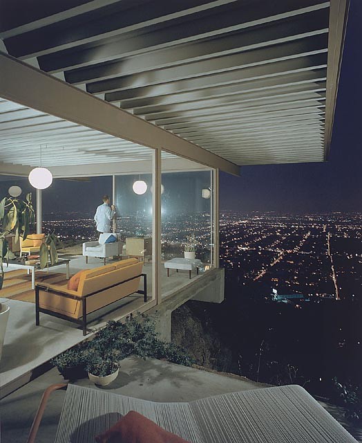
Case Study Houses was a residential experiment sponsored by the Arts & Architecture magazine, introducing the modern movement ideas for affordable and efficient housing during the post-war years in the US.
The result? Amazing houses by Richard Neutra, Raphael Soriano, Craig Ellwood, Charles and Ray Eames, Pierre Koenig and Eero Saarinen, built between 1945-1966 mostly in LA.
Most of you already know about this… mostly due to the incredible photos that registered this houses, reflecting more than just pure architecture, a lifestyle. And the man (genius) behind the lens was Julius Shulman, who passed away yesterday July 16th, 2009.
A selection of his photos after the break.
https://www.archdaily.com/29457/julius-schulman-1910-2009David Basulto
Rising Tides Competition results

When driving between SFO Airport and San Francisco on the edge of the Bay Area, I have always wondered what would happen when the sea level starts to rise.
Recently, the San Francisco Bay Conservation and Development Commission (BCDC) organized an ideas competition (open to any professionals, not just architects) to address the sea level rise in the Bay Area, looking for innovative and creative solutions to bring forward a vision of a future estuarine shoreline applicable to the San Francisco Bay and beyond. 130 entries from 18 countries were submitted.
Six teams were announced as the winners, splitting a cash prize of $25,000. Among these entries we find interesting ideas, such as Faulders Studio’s laser light barrier that measures the sea level, powered by tidal energy, Kuth Ranieri Architects’s ventilated levee to balance the sea/bay water levels, or SOM’s smart membrane under the golden gate bridge.
But, as usual in some competitions, the honorable mentions bring more disruptive ideas, embracing a vision on a post-flood city instead of preventing it. There’s also humor among the honorable mentions, “Failure: Bring your boots” or “About Rising Tides: It´s the Delta, you stupid”.
Will our future be amphibious?
All the awarded entries after the break:
https://www.archdaily.com/29258/rising-tides-competition-resultsDavid Basulto
Chaoyangmen SOHO / Zaha Hadid Architects

Bert from Moving Cities (a blog focused on contemporary architecture in China) just told us about a new project by Zaha Hadid in Beijing: Chaoyangmen Soho.
The announcement was made by Pan Shiyi, a real estate mogul chairman of SOHO China. Pan has been working on huge developments, such as the Commune by the Great Wall and several commercial projects in central Beijing.
What’s interesting on SOHO’s developments, is that they invite renowned architects to participate, under heavy budgets restrictions in order to delivery quality projects for the “stylish middle class”. They also have a great corporative culture as you can see on their website.
But back to this project, Bert points us out to a recent interview with Pan Shiyi:
Q: Which development project is your favourite? A: Chaoyangmen SOHO. It is our latest development. I asked British architect Zaha Hadid to design a creative project, and she did. The project is unique, like the Beijing bird´s nest .
Read more about this project at Pan Shiyi’s blog. More images after the break.
https://www.archdaily.com/29253/chaoyangmen-soho-zaha-hadid-architectsDavid Basulto
What is architecture?
For MAYA design, authors of this video, What is Architecture?, that is architecture.
https://www.archdaily.com/28823/what-is-architectureDavid Basulto
Prada Transformer, Position 2: Cinema

Rem Koolhaas’ latest project -The Prada Transformer- is not just a building, but also a statement on today´s state of architecture. Dubbed the anti-blob, this “object” rejects all common blobby shapes we have seen lately. Simple geometrical shapes (a circle, a cross, a rectangle and an hexagon) enclose a space that depending on its rotation results on different spaces suitable for fashion exhibitions, cinema, art exhibitions and other special events. Each face is the platform on which these activities take place, while also being served by the other faces enclosing the space.
A few weeks ago, we presented the Transformer at Position 1 (Fashion Exhibition) with photos by Iwan Baan . Now, he sent us his photo set for the Transformer at Position 2: Cinema.
From June 26th to July 5th, the Transformer used a center piece on one of the faces to project “Flesh, Mind and Soul”, a film festival co-curated by Alejandro González Iñárritu (director Babel, 21 Grams). Please note that the interiors are now almost all black.
As of now, the Transformer is going through some changes to debut on its new position on Jul 30th to host “Beyond Control”, an exhibition by the Prada Foundation.
More photos by Iwan Baan after the break and the complete photo set on Iwan’s website:
https://www.archdaily.com/28865/prada-transformer-position-2-cinemaDavid Basulto