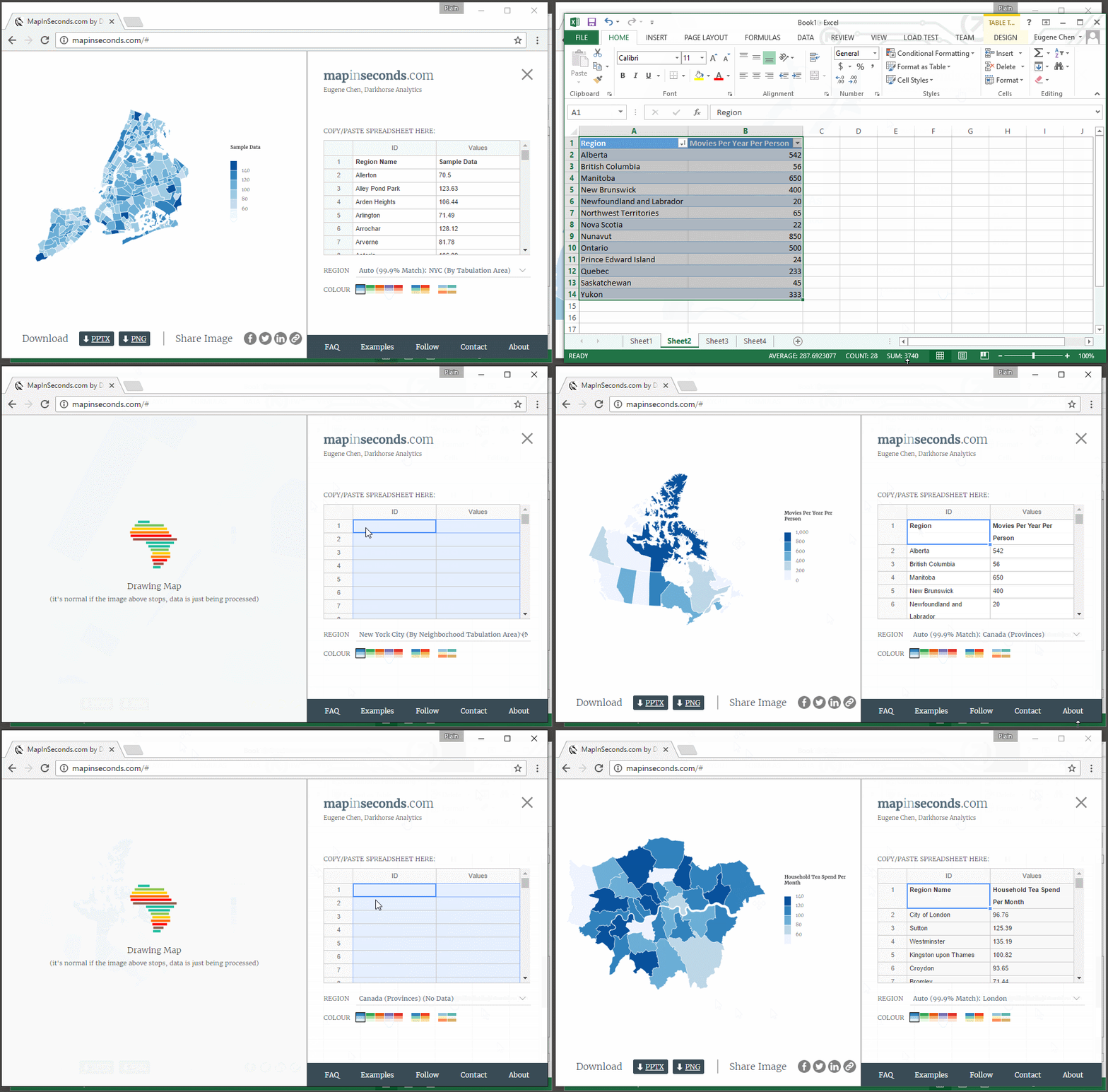
Have you ever had to create a map for your project, thinking you could get it done within 30 minutes, but then spent an entire afternoon on it? Between collecting data, creating a base map, choosing a color scheme, and finally putting together a graphic, creating a map can be a long, trying process, taking up precious time when you could be doing other work. Map-making shouldn’t be this way.
Created by Darkhorse Analytics, mapinseconds.com is a free online productivity tool which generates clear, quality maps based off of your data. Here’s how it works: collect and organize your data into two columns on either an Excel or Google spreadsheet, open mapinseconds.com, paste your data into the application’s spreadsheet, and voila! Your custom map is finished!

The geographic area covered by the map is automatically chosen for you and the colors adapt to either categorical or numerical data, all based on the data you provide. The legend also adapts to account for outliers, giving you the best, most readable map with no extra time investment. Examples shown on mapinseconds' demos show a graphic of the Kangaroo population across Australia and the number of Unicorns in New York City, but perhaps you need to show data on housing prices or access to green space—the possibilities are endless!


The result is a clean, easy-to-read map which can be downloaded as a PNG or Powerpoint Slide with the click of a button. Maps can be done within seconds, not hours.


